
Apparel Theme - Components
Components are -probably- the most important feature for Jumpseller stores, as they allow you to customize the look of your store in depth and with pretty much full control about subjects like what sections are displayed and where, the order in which they appear, what colors they have, the layout and way in which content is displayed and so on with other several options that we will cover in detail below.
Introduction to Components
Components are available at the Visual Editor of your store, within the Themes section and once you open this page you will immediately see that there are a few Components already added that we have defined as the most relevant ones for a store: Slider, Trustbar, Banners, Featured Products, Latest Products and Instagram.
Next we detail a few aspects about Components that you need to know in order to properly manage them in your store:
Components and Subcomponents
Some of these Components have subsections that we will refer to as Subcomponents. These elements are the ones that allow more flexibility to some Components by giving the chance to add several pieces of content. Components that have Subcomponents are the following:
- Slider >
Slidesubcomponent. - Trustbar >
Trustbar Blocksubcomponent. - Banners >
Bannersubcomponent. - Handpicked Products >
Store Productsubcomponent. - Collage >
Collage Itemsubcomponent. - Lookbook >
Lookbook Itemsubcomponent. - Flexible Content >
Flexible Content Blocksubcomponent. - Testimonials >
Testimonysubcomponent. - Logo Carousel >
Logosubcomponent. - Accordion >
Accordion Itemsubcomponent.
Templates
Components can be added on several templates (or pages) of your store, which include the following: Homepage, Categories, Products, Pages, Contact and Error page.
Something very important that you need to consider is that for Categories, Products and Pages, the Components you add will apply for ALL templates where you have defined it. For example, let’s say you have added a Banners component to the “Default” product template. This component will be displayed on all products that have that template applied.
Based on the previous, if you would like to customize this entirely and for example you may think or want to add different components for different products, you may need to create different “Product templates” so you can apply components for those specific templates.
If you want to look at examples on how to achieve this, you can visit the Tips & Tricks section on our website.
If you need to make changes or customize your theme, you can contact us directly and we would be glad to work with you.
Components Limits
Some Components can only be added once per page, while others can be added as many times as you need. The ones that are limited it’s mainly because they would display the same content or information and would look repetitive.
Here you can find the list of limited Components:
- Featured Products
- Latest Products
- Blog
- Newsletter
- Pop Up
It’s important to point out that still you can add these components on all the pages you want. So for example, you could add the Instagram component at the Homepage of your store but also on the Product pages.
Colors and Margins
As it was explained at the Theme Basics section, for all components you will have the ability to modify, change or adapt its colors and margins.
For all, except the Slide and Banner subcomponents, you will find the Customize Colors option that will enable the functionality to change the colors. If you don’t enable this, it doesn’t matter which colors you change, because those changes will not take effect until you do and will respect the colors defined at Themes > Visual Editor > Edit Settings > Theme Colors.
In the case of the Slide and Banner subcomponents, you won’t find the Customize Colors option as you will have the immediate ability to change and adapt the colors for all elements of the subcomponent. We did this way for these specific cases because as they work with images, it would be very likely that you will want to adapt colors and we thought it would be annoying for you to have to enable the option each time for each subcomponent.
As for the margins, mostly all components come with the same margin options: Top margin, Bottom margin, Top inner margin and Bottom inner margin. This will give you full flexibility and control to decide how components behave within each other in terms of separation, distance and spacing, even within the component itself.
Slider
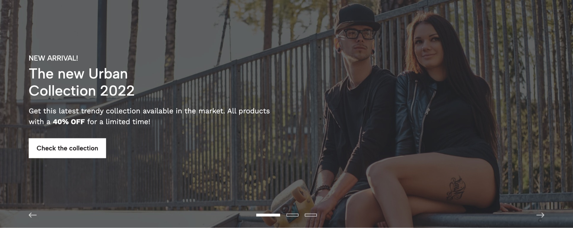
The Slider is a component that you may have seen very often on most websites/stores and it’s commonly positioned at the very top of the Homepage, although in terms of how Apparel has been thought and designed, you can add it wherever you want. This component works with the Slide subcomponent, which you will find and can read about it further down this documentation.
Its focus it’s so you can display very -if not probably- the most relevant and important information with content that can be related to things such as Products, Categories, Offers, Collections and so on.
The options available for you to customize this component are the following:
Slider Width
This option allows you to define the width that the section will have, based on two options:
- Browser Width: the width of the section will be 100% of the browser's width. You must consider the maximum width defined in Themes > Visual Editor > Edit Settings > Theme Styles.
- Grid Width: the section width will be based on the
Store's Gridwidth, which is approximately 1300px.
Slider Type
This option allows you to define the “type” of Slider that will be displayed, which works differently in terms of how images and content need to be uploaded and added.
1.- Image + Content
This is the option that comes selected by default. The key focus for it is that the images you can upload (Mobile and Desktop) are going to be used as backgrounds, therefore, they will be placed at the back of all the content you add (e.g. Title, Description, etc.) and they should not contain any over-highly designed graphics that can affect the readability of the content, because basically, they will work as a “decorative” or “contextual” image.
2.- Image only
For this option all the content that you want to include, like texts, titles, buttons, graphics, etc., must be within the image. This is commonly done through design softwares such as Photoshop, Illustrator, among others.
Enable Autoplay
If enabled, Slides will pass automatically from one to the next based on the speed defined in the option below.
Slides speed
Time that takes to pass from one Slide to the next, in seconds.
Navigation color
Allows to define the color that navigation arrows and dots will have.
Enable Arrows
Displays next and previous arrows for customers to navigate the Slider.
Enable Dots
Displays navigational dots (points) for customers to navigate the Slider.
Top margin
Allows to add a margin at the top of the section to separate it from other components.
Bottom margin
Allows to add a margin at the bottom of the section to separate it from other components.
Slide
This is the Subcomponent that can be added to the Slider component, which can be as many as you want but we suggest a maximum of 5. This is mainly because, based on ecommerce analysis data, there’s a relatively high chance that customers won’t wait much for Slides to pass from one to the next, so if you add too many of them, probably the latest ones won’t even get to be seen.
There are some key factors that need to be considered when adding Slides:
Not all fields are mandatory
Depending on what value you choose at the Slider Type option, there are some fields that you won’t need to fill.
Fully clickable Slides
This means that even if you opt to display a button for Slider Type option equal to Image + Content, the button or link will act merely as what it’s better known as a “Call to Action” element so customers can know that there’s an element that can be clicked, although, they will be able to click anywhere within the Slide available space.
Upload both Mobile and Desktop images
Even when you can upload just one of them, we strongly encourage you to upload both images at all times when possible. You can find a full detailed explanation about how Mobile and Desktop images work throughout the theme on the respective Tips & Tricks section.
What’s the “Content”?
The content is the section that includes the Subtitle, Title, Description and Link/Button. This will only be visible and displayed if Slider Type is equal to Image + Content.
Links and Buttons
You will find below that you can choose the style for the Link or Button of each Slide and this is intended to give you the most possible control on the design and look of your store and how it aligns with your brand design guidelines. Here you can find an example of how each style looks:
Here are all the options available to customize a Slide:
Image (mobile)
Image for Mobile devices with a maximum width of 575px and ideally in .jpg format.
Image (desktop)
Image for Desktop and Tablet devices with a minimum suggested width of 1600px and ideally in .jpg format.
Enable Overlay
The Overlay it's an element that positions itself between the content of the Slide and the image and allows to generate contrast between both for easier readability. Only necessary if Slider Type is equal to Image + Content. You can choose between the following options:
- Both Mobile and Desktop (default): will be visible on all devices.
- Mobile only: will be visible just for Mobile devices up to 575px.
- Desktop only: will be visible for Desktop and Tablet devices that are equal or higher than 576px.
- Disable: won't be visible on any device.
Overlay color
Background color for the Overlay.
Content Position
Allows you to define the horizontal position of the content. In Mobile devices content will stretch to the whole available space.
Content Alignment
Allows you to define the alignment of the content. In Mobile devices content will align to the center of the Slide by default.
Subtitle
Optional and only necessary if Slider Type is equal to Image + Content.
Subtitle Color
Color for the subtitle.
Title
Mandatory if Slider Type is equal to Image + Content. If you want to split the title into one or more lines, you can just press enter on your keyboard to create it.
Title Color
Color for the title.
Description
Optional and only necessary if Slider Type is equal to Image + Content. It will display a maximum of 150 characters.
We suggest you make it brief and direct and with no more than 2 lines in Desktop devices. The purpose of this description is to give context to customers about what they would find when they click on the Slide (or the button/link).
Description Color
Color for the description.
Link
Choose any content of the store, like categories, pages, products, external links, etc. When adding this link, the whole Slide will be clickable.
Link Text
Text that will be displayed inside the link. It should be brief, direct and attractive.
Enable Visible Link
If enabled, the link will be visible along with the content, although the entire Slide will still be completely clickable.
Enable Link Arrow
Displays an arrow at the right side of the link text.
Link Style
Allows to define the style of the link:
- Filled Button: It will have the default style like any other button of the store.
- Bordered Button: Will have a border and its background will be transparent.
- Normal Link: Will look like a normal link with a border at the bottom.
Link Text Color
Color for the text of the link.
Link Text Color (hover)
Color for the text that displays inside the link on hover state (when passing the mouse over).
Link Background Color
Background color of the link. This won't be applied if Link Style is equal to Normal Link.
Link Background Color (hover)
Background color of the link on hover state (when passing the mouse over). This won't be applied if Link Style is equal to Normal Link.
Trustbar
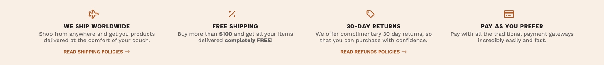
The focus of this component is to provide and display relevant and/or important information that can generate trust on your brand, as its name says it. This can be related to topics like for example how your store works, what it offers, what benefits customers can access to, if there are shipping discounts, if you have opened a new physical location, etc.
There are some key factors that need to be considered when adding this component:
Colors
You will find that you can customize colors, as it was explained in the first part of this documentation. If you don’t opt to do it, all the colors will be based on what’s defined at Themes > Visual Editor > Edit Options > Theme Colors.
Carousel
This component will always work within a Carousel logic, meaning that the amount of visible blocks will vary depending on the device where your store it’s being seen, so you can add all the blocks you need. If this didn’t work this way, it would make you store excessively tall, which is something that could have a negative effect considering that it’s very likely you will also add several other components to the page.
Icons
These are optional but we suggest you can implement them if you think they fit with your brand guidelines.
Texts
We suggest that you try to add very brief and direct texts, especially for the title and description, as this section is intended to display very specific information about your store. And if there are more details to inform, you can always add a link to a page that contains the complete full scope of that.
Here are all the options available to customize the Trustbar:
Blocks to show
How many blocks will be visible in Desktop devices. For tablets devices will always be 2 and for Mobile devices only 1.
Speed
Time that takes to pass from one block to the next.
Enable Icons
Allows you to enable or disable Icons for the all Component blocks.
Content Alignment
Allows you to define the alignment of the content:
- Centered (default): All the content will be aligned to the center on each block. Icons will be positioned before and on top of the block title.
- Left: All the content will be aligned to the left on each block. Icons will be positioned at the very left side, and the rest will be within a subsection at the right of it.
Auto Height
If enabled, the height of the section will vary depending on the height of each block. If disabled (default), the height of the section will be equal to the height of the tallest block.
Customize Colors
If enabled, you will be able to customize colors with the options you'll find below. If not enabled, it will consider the colors defined in Themes > Visual Editor > Edit Settings > Theme Colors.
Background Color
Color for the background of the section. This is the only color that can be modified without having to enable Customize Colors.
Icons Color
Color that will be applied to all the icons of the component.
Titles Color
Color that will be applied to all the titles of the component.
Description Color
Color that will be applied to all the descriptions of the component.
Links Color
Color that will be applied to all the links of the component.
Links Color (hover)
Color that will be applied to all the links of the component in hover state (when passing the mouse over).
Top margin
Allows to add a margin at the top of the section to separate it from other components.
Bottom margin
Allows to add a margin at the bottom of the section to separate it from other components.
Top inner margin
Allows to add an inner margin at the top of the section to generate more space between the content and the background.
Bottom inner margin
Allows to add an inner margin at the bottom of the section to generate more space between the content and the background.
Trustbar Block
This is the Subcomponent that you can add as many times as you need to the Trustbar component and we will refer to them as Blocks. The elements that you can add to each block are the following:
Icon
Here you can select an icon by typing any letter and the icons list will be displayed. The position of the icon will depend on the option you select at Content Alignment. There's no need to choose anything here if Enable Icons is disabled.
Icon Style
Allows to define a style for the icon selected before. If the icon you choose is a Brand, like for example Instagram, Facebook, etc., there's no need to select anything here.
Title
Mandatory. Make it brief, simple and direct.
Description
Optional, but ideal and brief. Displays below the title.
Link
Choose any content of the store, like categories, pages, products, external links, etc.
Link Text
Text that displays in the link. Mandatory if a Link is added.
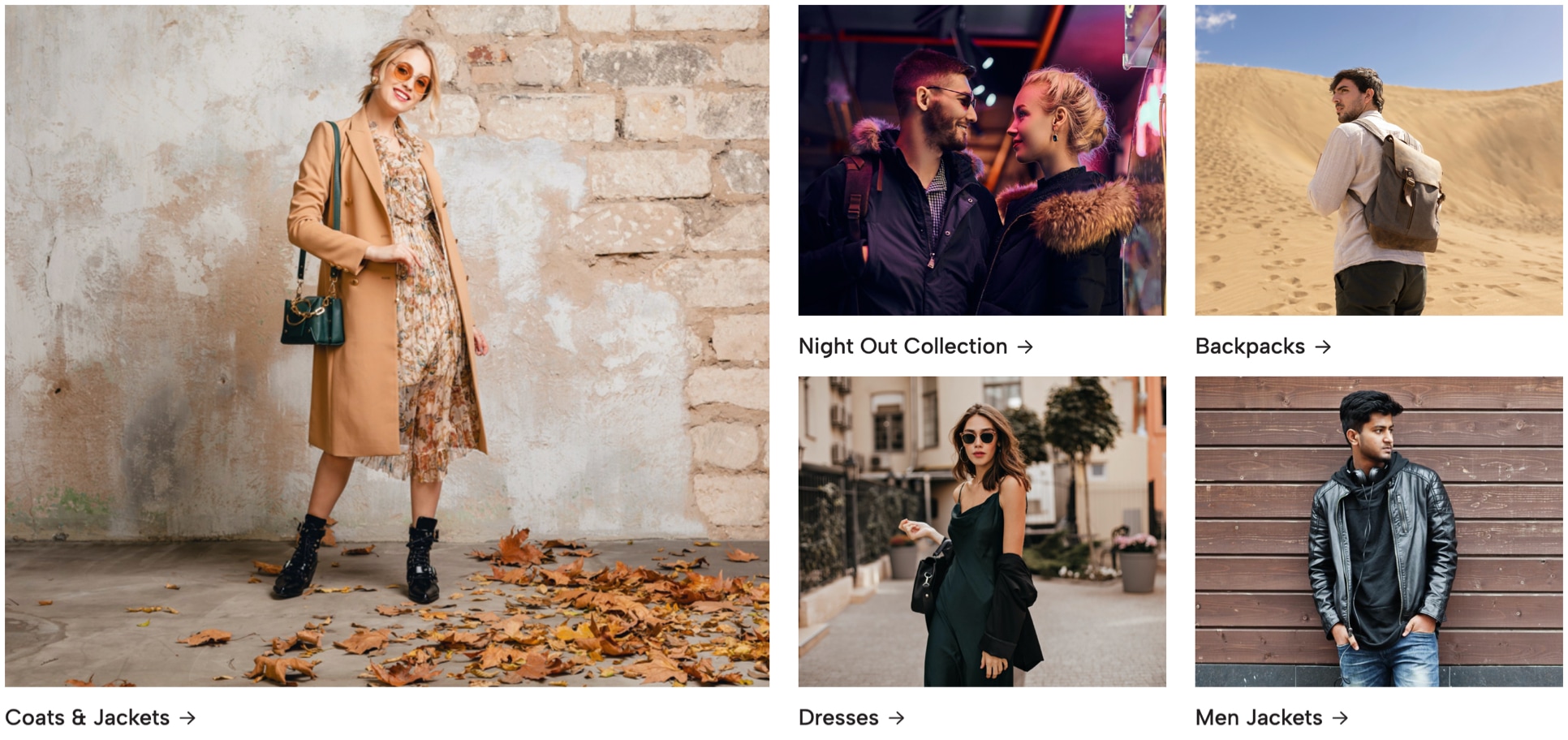
Banners
- Live examples:
- Banners Example

Banners are one of the most commonly used elements on any store and in Apparel you can configure them to be displayed in many ways and they work very similar, in what respects to images, to how the Slider component and Slide subcomponent works.
There are some key factors that need to be considered when adding this component:
Mobile and Desktop images
Independently of what you select at the Banners Type option, we encourage you to upload both Mobile and Desktop images, taking into consideration the Mobile First approach, and try to optimize them as best as you can. You can read more about how to optimize images at our Tips & Tricks section.
Images dimensions
The dimensions in which you will need to upload your images will vary depending on the combination of options you select at the component settings. Here you can find a wide range of examples for all those combinations.
Carousel vs Grid
As you will find below, you can choose how Banners will be displayed within the component and even when you will be able to display them in columns (Grid), we suggest that you choose the Carousel option, as it will perform better on Mobile devices.
The options available for you to customize this component are the following:
Banners Type
Allows to define how Banners will work on the component, based on two options that have the same logic as the Slider component:
1) Image + Content
The image(s) you upload will be used as background images and therefore, you must define at least a Title for each Banner.
2) Image only
The image(s) you upload must include all elements, like titles, texts, buttons and graphics within the Banner. This is mostly designed in softwares like for example Photoshop or Illustrator, among others.
Display Type
This option allows you to define how and where Banners will be positioned within the store’s grid, based on two options:
1) Carousel
Banners will be shown inside a Carousel, where the amount of banners displayed will be based on the device type where they are going to be seen. You can select the amount of Banners to be displayed for Desktop devices on the next option.
2) Grid
Banners will be shown one next to the other in columns. In mobile devices they will stack vertically one below the other.
Banners per Row
How Banners behave and display will depend on what you define in the previous option:
1) Grid
How many banners will be shown horizontally in Desktop devices. If you select 3, that means 3 banners per horizontal row. Therefore, if you add 6 banners, this will result in 2 rows of 3 banners each.
2) Carousel
If you select 3, in Desktop devices 3 banners will be visible. For tablets it will always display 2 and for mobile devices only 1.
Enable Autoplay
If Carousel is selected at the Display Type option, this will make it pass automatically from one banner to the next.
Banners speed
Time that takes to pass from one Banner to the next, if Carousel is selected at the Display Type option.
Enable Arrows
Displays next and previous arrows for customers to navigate the Carousel.
Enable Dots
Displays navigational dots (points) for customers to navigate the Carousel.
Background Color
Background color of the section.
Top margin
Allows to add a margin at the top of the section to separate it from other components.
Bottom margin
Allows to add a margin at the bottom of the section to separate it from other components.
Top inner margin
Allows to add an inner margin at the top of the section to generate more space between the content and the background.
Bottom inner margin
Allows to add an inner margin at the bottom of the section to generate more space between the content and the background.
Featured Products
- Live examples:
- Featured Products Example
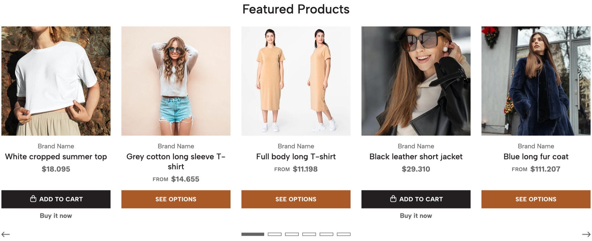
This Component allows you to display all the products that you’ve marked as featured in your store and can be added only once in a page, as it was explained at the introduction of the Theme Components section.
The way to mark a products as featured is pretty simple and you can find the step by step next:
- Go to Products > All products at your store’s Admin panel. There you will find the complete list of products of your store.
- Click on the image or the name of any product to access its admin page.
- At the right side of the screen, on the Status section you will find the option to mark it as
featured. - Click the “Save” green button at the top right corner.
If you want to see the full list of featured products the procedure is very similar:
- Go to Products > All products at your store’s Admin panel. There you will find the complete list of products of your store.
- Before the products list you will find a “filter bar” which has three options. Click on the third one at the right side.
- A dropdown menu will display and you need to click on the one that says
Featuredwhich will also have the amount of products of that filter inside parenthesis. - This action will filter the list of products showing just the featured ones.
If you want to do this through CSV, we suggest you check this Jumpseller article where they explain in detail how’s the proper procedure and steps you need to follow.
The options available for you to customize this component are the following:
Display Type
Allows you to define how products will be displayed:
- Carousel: with arrows and dots to navigate it.
- Grid: the same way products are shown in a category page, in columns.
Products limit
Limit the amount of products that the section will display. The interval is based on multiples of 5 products, considering the maximum number of products that will be displayed on Desktop devices.
Subtitle
Optional. Subtitle of the section.
Title
Title of the section. By default the text “Featured Products” will be displayed, which you can change at the Languages settings of your store or by filling this field.
Description
Optional. Description of the section.
Link
Choose any content of the store, like categories, pages, products, external links, etc.
Link Text
Text that displays in the link. By default the text "See more products" will be displayed, which you can change at the Languages settings of your store or by filling this field.
Enable Autoplay
If enabled, products will pass automatically from one to the next based on the speed defined in the option below. Only applies if Display Type is equal to Carousel.
Carousel speed
Time that takes to pass from one product to the next, if Autoplay is enabled.
Enable Arrows
Displays next and previous arrows for customers to navigate the Carousel.
Enable Dots
Displays navigational dots (points) for customers to navigate the Carousel.
Customize Colors
If enabled, you can customize colors with the options you'll find below. If not enabled, it will consider the colors defined in Themes > Visual Editor > Edit Settings > Theme Colors.
Background Color
Background color of the section. This is the only color that can be modified without having to enable Customize Colors.
Subtitle color
Color for the subtitle of the section.
Title color
Color for the title of the section.
Description color
Color for the description of the section.
Link color
Color for the link of the section.
Top margin
Allows to add a margin at the top of the section to separate it from other components.
Bottom margin
Allows to add a margin at the bottom of the section to separate it from other components.
Top inner margin
Allows to add an inner margin at the top of the section to generate more space between the content and the background.
Bottom inner margin
Allows to add an inner margin at the bottom of the section to generate more space between the content and the background.
Latest Products
- Live examples:
- Latest Products Example
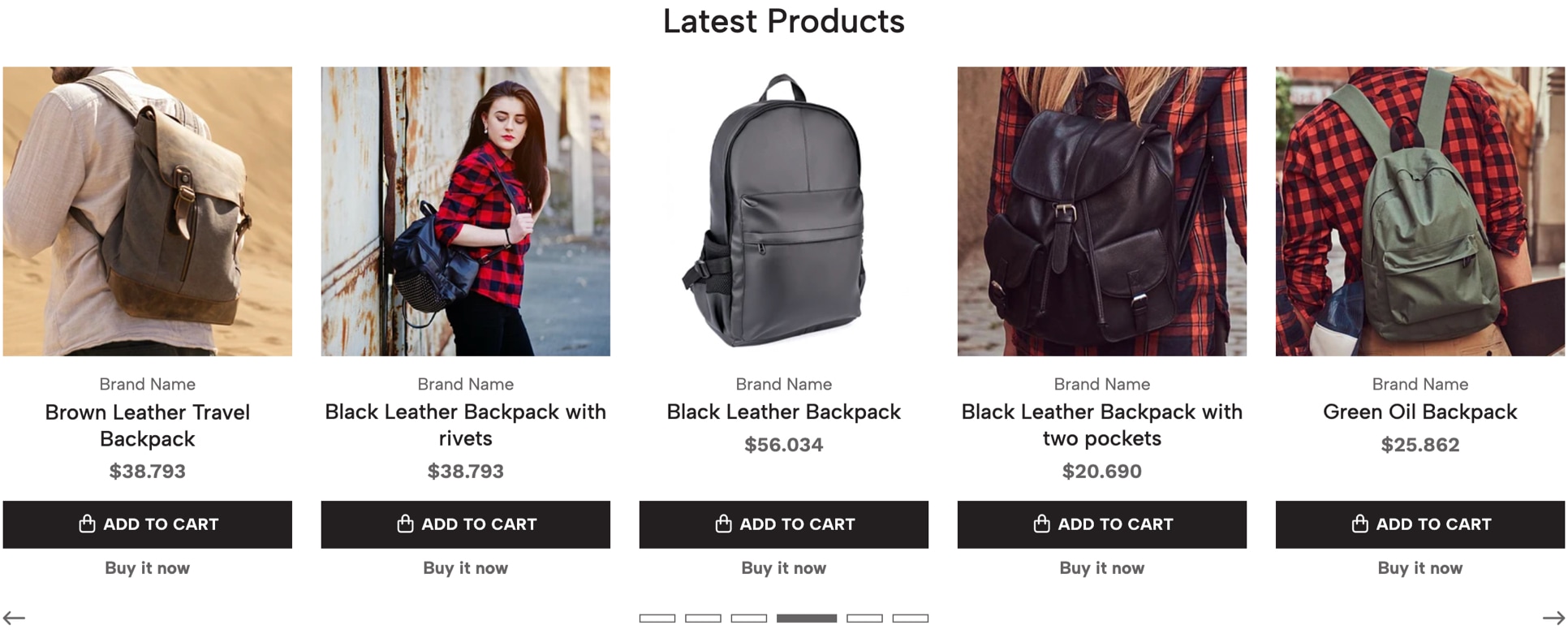
This component allows you to display the latest 40 products (maximum) that have been created and/or added to the store. The order in which products will be displayed is automatic and will be based on the order you created them, therefore, you won’t be able to re-order them like you can in categories.
Here are all the options available to customize this component:
Display Type
Allows you to define how products will be displayed:
- Carousel: with arrows and dots to navigate it.
- Grid: the same way products are shown in a category page, in columns.
Products limit
Limit the amount of products that the section will display.
Subtitle
Optional. Subtitle of the section.
Title
Title of the section. By default the text "Latest Products" will be displayed, which you can change at the Languages settings of your store or by filling this field.
Description
Optional. Description of the section.
Link
Choose any content of the store, like categories, pages, products, external links, etc.
Link Text
Text that displays in the link. By default the text "See more products" will be displayed, which you can change at the Languages settings of your store or by filling this field.
Enable Autoplay
If enabled, products will pass automatically from one to the next based on the speed defined in the option below. Only applies if Display Type is equal to Carousel.
Carousel speed
Time that takes to pass from one product to the next, if Autoplay is enabled.
Enable Arrows
Displays next and previous arrows for customers to navigate the Carousel.
Enable Dots
Displays navigational dots (points) for customers to navigate the Carousel.
Customize Colors
If enabled, you can customize colors with the options you'll find below. If not enabled, it will consider the colors defined in Themes > Visual Editor > Edit Settings > Theme Colors.
Background Color
Background color of the section. This is the only color that can be modified without having to enable Customize Colors.
Subtitle color
Color for the subtitle of the section.
Title color
Color for the title of the section.
Description color
Color for the description of the section.
Link color
Color for the link of the section.
Top margin
Allows to add a margin at the top of the section to separate it from other components.
Bottom margin
Allows to add a margin at the bottom of the section to separate it from other components.
Top inner margin
Allows to add an inner margin at the top of the section to generate more space between the content and the background.
Bottom inner margin
Allows to add an inner margin at the bottom of the section to generate more space between the content and the background.
Handpicked Products
This component allows you to add any product of your store, regardless of its category relation, with a maximum amount of 20. The reason behind this limit is to try to enhance and optimize the store performance as much as possible, in order to not increase the loading speed unnecessarily.
Here are all the options available to customize this component:
Display Type
Allows you to define how products will be displayed:
- Carousel: with arrows and dots to navigate it.
- Grid: the same way products are shown in a category page, in columns.
Subtitle
Optional. Subtitle of the section.
Title
Title of the section. By default the text “Handpicked Products” will be displayed, which you can change at the Languages settings of your store or by filling this field.
Description
Optional. Description of the section.
Link
Choose any content of the store, like categories, pages, products, external links, etc.
Link Text
Text that displays in the link. By default the text "See more products" will be displayed, which you can change at the Languages settings of your store or by filling this field.
Enable Autoplay
If enabled, products will pass automatically from one to the next based on the speed defined in the option below. Only applies if Display Type is equal to Carousel.
Carousel speed
Time that takes to pass from one product to the next, if Autoplay is enabled.
Enable Arrows
Displays next and previous arrows for customers to navigate the Carousel.
Enable Dots
Displays navigational dots (points) for customers to navigate the Carousel.
Customize Colors
If enabled, you can customize colors with the options you'll find below. If not enabled, it will consider the colors defined in Themes > Visual Editor > Edit Settings > Theme Colors.
Background Color
Background color of the section. This is the only color that can be modified without having to enable Customize Colors.
Subtitle color
Color for the subtitle of the section.
Title color
Color for the title of the section.
Description color
Color for the description of the section.
Link color
Color for the link of the section.
Top margin
Allows to add a margin at the top of the section to separate it from other components.
Bottom margin
Allows to add a margin at the bottom of the section to separate it from other components.
Top inner margin
Allows to add an inner margin at the top of the section to generate more space between the content and the background.
Bottom inner margin
Allows to add an inner margin at the bottom of the section to generate more space between the content and the background.
Category Products
This component allows you to display products from a specific category of your store. The order in which they appear will be based on the order defined at the category's product list, therefore, you can reorder them by following the next steps:
- At the main menu of your Store’s Administration panel go to Products > All products.
- Once the page loads you will see the full list of products of your store and at the top of it you will find the filters section. Click on the second one and type the name of the category you want to see products from.
- The page will load briefly displaying the products from that category. You just need to click & hold the mouse of the product you want and move it to the position you want.
Here are all the options available to customize this component:
Category
Mandatory. Select the Category from which you want to show products. This component won't display if you don't choose something here.
Display Type
Allows you to define how products will be displayed:
- Carousel: with arrows and dots to navigate it.
- Grid: the same way products are shown in a category page, in columns.
Products limit
Limit the amount of products that the section will show.
Subtitle
Optional. Subtitle of the section.
Title
Title of the section. By default it will display the name of the Category you have selected. You can change it by filling this field.
Description
Optional. Description of the section.
Enable Link
Allows you to show or hide the link to the page of the Category you have selected.
Link Text
Text that displays in the link. By default the text "See more products" will be displayed, which you can change at the Languages settings of your store or by filling this field.
Enable Autoplay
If enabled, products will pass automatically from one to the next based on the speed defined in the option below. Only applies if Display Type is equal to Carousel.
Carousel speed
Time that takes to pass from one product to the next, if Autoplay is enabled.
Enable Arrows
Displays next and previous arrows for customers to navigate the Carousel.
Enable Dots
Displays navigational dots (points) for customers to navigate the Carousel.
Customize Colors
If enabled, you can customize colors with the options you'll find below. If not enabled, it will consider the colors defined in Themes > Visual Editor > Edit Settings > Theme Colors.
Background Color
Background color of the section. This is the only color that can be modified without having to enable Customize Colors.
Subtitle color
Color for the subtitle of the section.
Title color
Color for the title of the section.
Description color
Color for the description of the section.
Link color
Color for the link of the section.
Top margin
Allows to add a margin at the top of the section to separate it from other components.
Bottom margin
Allows to add a margin at the bottom of the section to separate it from other components.
Top inner margin
Allows to add an inner margin at the top of the section to generate more space between the content and the background.
Bottom inner margin
Allows to add an inner margin at the bottom of the section to generate more space between the content and the background.
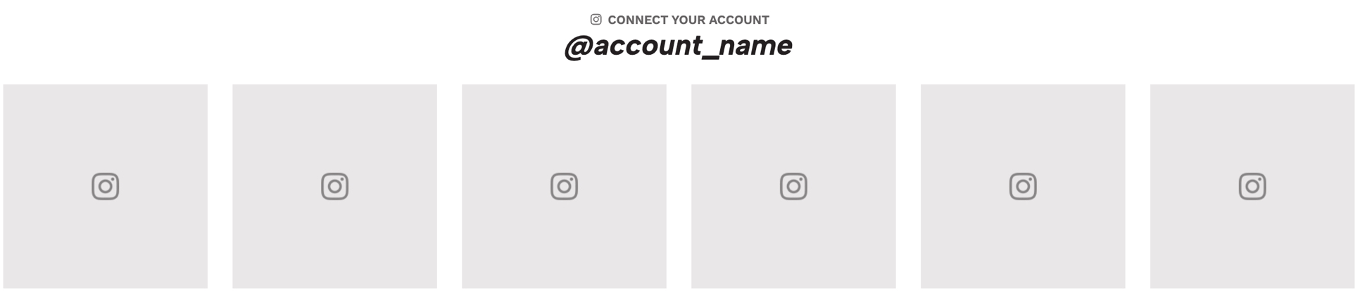
This component allows you to display the latest posts from your Instagram account. It works by connecting an Instagram profile to your Jumpseller store allowing access. Next you can find the step by step:
- At the main menu of your Store’s Administration panel go to Settings > General > Preferences > Business Information > Social Media and click on the Edit information button.
- Once there you need to scroll down to the very bottom of the page until you find the
Instagram sectionand click on the InstagramLogin button. - You will be redirected to the Instagram authorization page. Click on the "Allow button". After loading you will be taken back to your store’s Administration panel.
- Once that’s done both accounts will be fully connected and you can now configure the
Component.
There are some key factors that need to be considered when adding this Component:
Component limit
As it was mentioned at the introduction of the Components section, this component can only be added once per page. So for example, you can add it just one time at the Homepage of your store.
Minimum posts amount
You need to consider that the Component displays a minimum of 6 posts, so if you have 5 or less it may not look so good until you comply with that minimum amount.
Instagram dependency
As this connection relies completely on how Instagram works and their security measures, it could happen at some point that the component doesn’t display your posts correctly or it stops syncing them. In that case, you can just do the same process again in order to restore it.
Here are all the options available to customize this component:
Width
Allows to define the width that the section will have:
- Grid Width: The width of the section aligns with the maximum width that the store container grid has.
- Full Width: The width of the section takes 100% of the browser's width.
Posts quantity
Number of posts that will be displayed in the Instagram feed, between 6, 8 or 12. The main reason for this is to prevent your store’s loading speed from being negatively affected by displaying too many images.
Display Type
Allows you to define the way in how posts will be displayed in the section:
- Grid: Posts will be shown one next to the other in columns. In mobile devices they will stack vertically.
- Carousel: Posts will be shown inside a Carousel.
Space between posts
Allows to define if posts will have a small separation between them or if they will be displayed together (without space).
Enable Instagram icon
Allows to hide or show the Instagram icon that goes along with the Title of the section.
Title
By default the text "Follow us on Instagram” will be displayed, which you can change at the Languages settings of your store or by filling this field.
Enable Autoplay
If enabled, Instagram posts will pass from one to the next automatically. This will only work if Display Type is equal to Carousel.
Carousel speed
Time that takes to pass from one post to the next, in seconds.
Enable Arrows
Displays next and previous arrows for customers to navigate the Carousel. Will only be displayed if Display Type is equal to Carousel.
Enable Dots
Displays navigational dots (points) for customers to navigate the Carousel. Will only be displayed if Display Type is equal to Carousel.
Customize Colors
If enabled, you can customize colors with the options you'll find below. If not enabled, it will consider the colors defined in Themes > Visual Editor > Edit Settings > Theme Colors.
Background Color
Background color of the section. This is the only color that can be modified without having to enable Customize Colors.
Title color
Color for the title of the section.
Account name color
Color for the Account name of the section. This is the name that will be visible once you sync your Instagram account.
Account name color (hover)
Color for the account name of the section on hover state (when passing the mouse over).
Overlay color
Color for the Overlay element that appears when the customer places the mouse over a post and displays the text "View on Instagram".
Top margin
Allows to add a margin at the top of the section to separate it from other components.
Bottom margin
Allows to add a margin at the bottom of the section to separate it from other components.
Top inner margin
Allows to add an inner margin at the top of the section to generate more space between the content and the background.
Bottom inner margin
Allows to add an inner margin at the bottom of the section to generate more space between the content and the background.
Newsletter
- Live examples:
- Newsletter Example

This component allows you to display a Newsletter Form that can be connected with a Mailchimp’s Audience that you own, so your customers can subscribe directly to that list. In order for this component to work you must consider some key factors:
Mandatory fields
There are two mandatory fields that you must fill in, which are detailed further below, otherwise the component will not be displayed.
Suggested texts
We encourage you to add a very compelling description that attracts customers to subscribe to your newsletter. Also, if you think it’s necessary, add a Disclaimer text so customers are aware of what they are accepting when subscribing.
Form type
Although the default form comes only with the Email field, we suggest that you use the Full version, as it will allow you to better customize the newsletter emails that will be sent, by having the name and surname of your subscribers.
Here are all the options available to customize this component:
Mailchimp URL
Mandatory. URL of the Mailchimp's form, which you can find at the Embedded code section of your Mailchimp account, in the Audiences settings.
Audience ID number
Mandatory. This is an alphanumeric code (ex. 4a44a2fa19) that needs to be included, in order to prevent spam emails from subscribing to your Mailchimp account. More info visit the following link: https://mailchimp.com/help/find-audience-id/
Newsletter Width
Allows you to define the width of the section, based on two options:
- Browser Width: The width of the section takes 100% the browser's width.
- Grid Width: The width of the section aligns with the maximum width that the store container grid has.
Form type
Allows you to select the type of form for the Newsletter, based on two options:
- Full: Includes the email address, name and surname fields.
- Simple (default): Includes only the email address field.
The option you choose will affect the position in which the Content (Title and Description) and the Form will display, as you can see in the images below:
Content Alignment
Allows you to define the alignment of the Newsletter, which will affect all texts like the Title and the Description, as well as the texts that display inside the form fields.
Title
By default “Subscribe to our Newsletter” will be displayed, which you can change at the Languages settings of your store or by filling this field.
Description
By default the text “Sign up to receive the latest news and updates” will be displayed, which you can change at the Languages settings of your store or by filling this field.
It goes below the Title and its focus should be on detailing customers the benefits for subscribing.
Disclaimer
Text that displays below the Newsletter form field(s). This is helpful to let customers know, for example, that they accept certain terms before subscribing.
Disclaimer Link
Allows you to add a Link inside the Disclaimer text, for example to a page that details certain policies or provides information about what customers accept when subscribing.
Disclaimer text where you want the link to be displayed: [link]Disclaimer Link Text
This is the text that will be displayed within the [link] tag, inside the Disclaimer text.
Button Text
By default the text "Subscribe” will be displayed, which you can change at the Languages settings of your store or by filling this field.
Background image (mobile/tablets)
Background image for mobile and tablet devices. Width must have a minimum of 767px for optimal results and format should ideally be .jpg. If the image is in .png format, we suggest optimizing it as much as possible.
Background image (desktop)
Background image for desktop devices. The image width must be considering the following:
- A minimum width of 1600px if
Newsletter WidthequalsBrowser Widthor; - A maximum width of 1296px if
Newsletter WidthequalsGrid Width.
For optimal results, the format should ideally be .jpg. If the image is in .png format, we suggest optimizing it as much as possible.
Enable Overlay
The Overlay it's an element that positions itself between the content of the Newsletter and the background image and allows to generate contrast between both for easier readability. Will only display if at least one of the background images has been uploaded.
Customize Colors
If enabled, you will be able to customize colors with the options you'll find below. If not enabled, it will consider the colors defined in Themes > Visual Editor > Edit Settings > Theme Colors.
Background color
Background color of the section. Only visible if no image is added. This is the only color that can be modified without having to enable Customize Colors.
Title color
Color for the title of the section.
Description color
Color for the description of the section.
Disclaimer color
Color for the disclaimer text of the section.
Disclaimer Link color (hover)
Color for the Disclaimer Link on hover state (when passing the mouse over).
Button Text color
Color for the text of the button.
Button Text color (hover)
Color for the text of the button on hover state (when passing the mouse over).
Button Background color
Color for the background of the button.
Button Background color > Hover
Color for the background of the button in hover state (when passing the mouse over).
Overlay color
Background color for the Overlay.
Top margin
Allows to add a margin at the top of the section to separate it from other components.
Bottom margin
Allows to add a margin at the bottom of the section to separate it from other components.
Top inner margin
Allows to add an inner margin at the top of the section to generate more space between the content and the background.
Bottom inner margin
Allows to add an inner margin at the bottom of the section to generate more space between the content and the background.
Blog
- Live examples:
- Blog Example
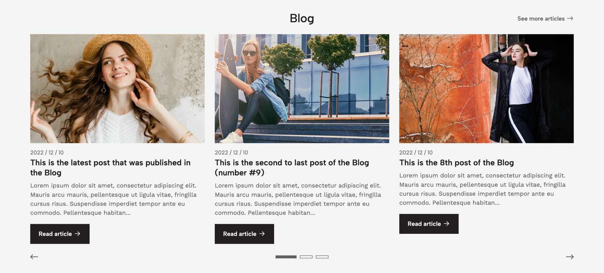
This component allows you to display the latest articles from the Blog of your store, with a maximum amount of 10. For more information on how several things about the Blog of your store work, check the respective section at the start of this documentation.
There are some key factors that you need to know related to this component:
Reversed method
The way in which articles will appear is based on a “reversed” logic, which means that the latest article (post) you upload to your store will be the first to appear in the Carousel. This also applies for the Blog page as well.
Articles limit
The maximum amount of articles that can be displayed is intended to optimize as best as possible your store’s loading speed, because if we would allow too many articles, considering all the information that would be visible, it could negatively affect it.
Here are all the options available to customize this component:
Articles to show
Allows you to define how many articles will be displayed in Desktop devices. For small Tablets only 2 articles will be displayed and for Mobile devices only 1.
Articles Limit
Allows you to define the maximum amount of articles that will be displayed in the section.
Subtitle
Optional. Subtitle of the section.
Title
Title of the section. By default the text “Blog” will be displayed, which you can change at the Languages settings of your store or by filling this field.
Description
Optional. Description of the section with a maximum amount of 125 characters.
Enable Link
Displays the link to the Blog page, which you can edit by going to Themes > Visual Editor > Edit Settings > Blog & Articles.
Link Text
Text that displays in the link. By default “See more articles” will be displayed, which you can change at the Languages settings of your store or by filling this field.
Enable Autoplay
If enabled, articles will pass automatically from one to the next based on the speed defined in the option below.
Carousel speed
Time that takes to pass from one article to the next, in seconds.
Enable Arrows
Displays next and previous arrows for customers to navigate the Carousel.
Enable Dots
Displays navigational dots (points) for customers to navigate the Carousel.
Customize Colors
If enabled, you can customize colors with the options you'll find below. If not enabled, it will consider the colors defined in Themes > Visual Editor > Edit Settings > Theme Colors.
Background Color
Background color of the section. This is the only color that can be modified without having to enable Customize Colors.
Subtitle color
Color for the subtitle of the section.
Title color
Color for the title of the section.
Description color
Color for the description of the section.
Link color
Color for the link of the section.
Top margin
Allows to add a margin at the top of the section to separate it from other components.
Bottom margin
Allows to add a margin at the bottom of the section to separate it from other components.
Top inner margin
Allows to add an inner margin at the top of the section to generate more space between the content and the background.
Bottom inner margin
Allows to add an inner margin at the bottom of the section to generate more space between the content and the background.
Collection
- Live examples:
- Collection Example
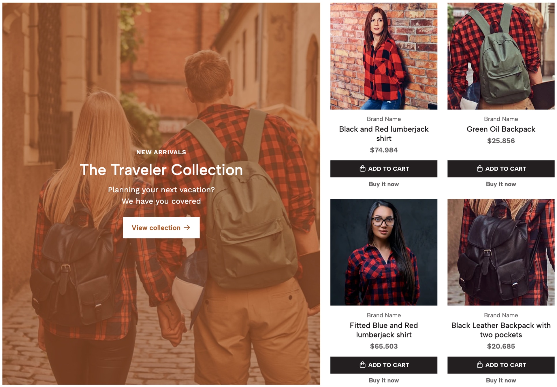
This component allows you to display a maximum of 4 products from a specific category, along with a section that displays content. The order in which products appear will be based on the order defined at the category products list.
There are some key factors that you need to know related to this component:
Content
The content of this component is composed of four elements: Subtitle, Title (or category name), Description and Link (to the category). On Desktop devices it will be displayed at the left or right side of the section, which you can modify the order it appears. For small Tablets and Mobile devices the content will be placed on top of the products list.
Products limit
As it was stated at the introduction of this component, it will only display the first 4 products of the category you select. If the category has more products, we suggest you don’t disable the link to the category page, so customers will be able to see them all. You can re-order the products that will display on the component by following these simple steps:
- At the main menu of your Store’s Administration panel go to Products > All products.
- Once the page loads you will see the full list of products of your store and at the top of it you will find the filters section. Click on the second one and type the name of the category you want to see products from.
- The page will load briefly displaying the products from that category. You just need to click & hold the mouse on the product you want and move it to the position you want.
Mobile and Desktop background images
You can add a background image for both devices which will be positioned at the back of the content. Each image will be displayed depending on the width of the device where the customer is seeing your store and therefore the dimensions for each one should be ideally as detailed in the following table:
| Device | Device Width | Image dimension |
|---|---|---|
| Mobile & Tablets | < 767px | 767x426px |
| Desktop | > 768px | 800x850px |
You need to consider a few things when working these images before uploading them:
- Images will be positioned vertically and horizontally at the center of the content;
- The height of the image will directly depend on the height that the content has. So for example if the content’s height on Mobile is 500px, the image height for that device should be at least that.
Here are all the options available to customize this component:
Category
Mandatory. Select the Category from which you want to show products. The component won't display if you don't choose something here.
Content Order
Allows you to define the order in which elements display.
Background Image (mobile)
Image for Mobile and Tablet devices with a maximum width of 767px and in .jpg format.
Background Image (desktop)
Image for Desktop devices with a minimum suggested width of 800px and in .jpg format.
Enable Overlay
Allows to enable the Overlay element that positions itself between the content and the background images, to generate contrast between both for an easier readability:
- Both Mobile and Desktop: will be visible on all devices.
- Mobile only: will be visible just for Mobile devices up to 575px.
- Desktop only: will be visible for Desktop and Tablet devices that are equal or higher than 576px.
- Disable (default): won't be visible on any device.
Content Position
Position of the content of the section (subtitle, title, description and link). For Mobile devices content will stretch to the entire available space.
Content Alignment
Alignment of the content of the section (subtitle, title, description and link). For Mobile devices content will align to the center.
Subtitle
Optional. Subtitle of the section.
Title
Title of the section. By default the name of the Category you selected will be displayed, which you can replace by filling this field. If you want the title to be in two or more lines, just press enter to create them.
Description
Optional. Description of the section.
Enable Link
Allows to show or hide the link that takes to the Category page you have selected.
Link Text
Text that will be displayed inside the link. By default “See more products” will be shown, which you can change at the Translations settings of your store or by filling this field.
Enable Link Arrow
Displays a right arrow inside the link.
Link Style
Allows to define the style of the link:
- Filled Button: It will have the default style like any other button of the store.
- Bordered Button: Will have a border and its background will be transparent.
- Normal Link: Will look like a normal link with a border at the bottom.
Customize Colors
If enabled, you will be able to customize colors with the options you'll find below. If not enabled, it will consider the colors defined in Themes > Visual Editor > Edit Settings > Theme Colors.
Background Color
Background color of the section. This is the only color that can be modified without having to enable Customize Colors.
Overlay color
Background color for the Overlay element.
Content Background Color
Background color of the content which contains the Subtitle, Title, Description and Link. If no image is added, this color will be visible.
Subtitle color
Color for the subtitle of the section.
Title color
Color for the title of the section.
Description color
Color for the description of the section.
Link Text Color
Color for the text of the link.
Link Text Color (hover)
hover state (when passing the mouse over).
Link Background Color
Background color of the link. This won't be applied if Link Style is equal to Normal Link.
Link Background Color (hover)
Background color of the link on hover state (when passing the mouse over). This won't be applied if Link Style is equal to Normal Link.
Top margin
Allows to add a margin at the top of the section to separate it from other components.
Bottom margin
Allows to add a margin at the bottom of the section to separate it from other components.
Top inner margin
Allows to add an inner margin at the top of the section to generate more space between the content and the background.
Bottom inner margin
Allows to add an inner margin at the bottom of the section to generate more space between the content and the background.
Collage
- Live examples:
- Collage Example
This component allows you to display content such as categories, products and pages within a collage-style composition with a maximum of 5 collage items. In order to be displayed, you must add at least two items.
There are certain functionalities that need to be understood before adding this component:
Items adaptation
Images -and therefore items- will adapt to the available space within a predefined composition that you can see explained below:
Heading
As it was explained at the beginning of this documentation, you can enable a Heading section that contains the following optional elements for being added: Subtitle, Title, Description and Link.
Here are all the options available to customize this component:
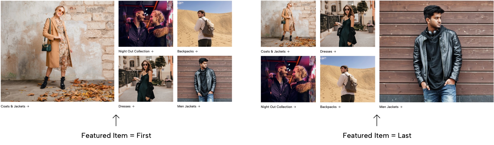
Featured Item
Allows you to define which of all the Collage Items you add will look bigger and stand out from the rest. Here you can see an example of how both options would look and affect items:
Enable Heading
Enables the Heading at the start of the section, before the Collage. Even if this is enabled, it will only appear if at least one of these fields are filled: Subtitle, Title or Description.
Subtitle
Optional. Subtitle of the section.
Title
Optional. Title of the section.
Description
Optional. Description of the section.
Link
Optional. Choose any content of the store, like categories, pages, products, external links, etc.
Link Text
Text that displays in the link. Mandatory if Link is added.
Customize Colors
If enabled, you will be able to customize colors with the options you'll find below. This applies as well to all Collage Items. If not enabled, it will consider the colors defined in Themes > Visual Editor > Edit Settings > Theme Colors.
Background Color
Background color of the section. This is the only color that can be modified without having to enable Customize Colors.
Subtitle color
Color for the subtitle of the section.
Title color
Color for the title of the section.
Description color
Color for the description of the section.
Link Color
Color for the text of the link.
Top margin
Allows to add a margin at the top of the section to separate it from other components.
Bottom margin
Allows to add a margin at the bottom of the section to separate it from other components.
Top inner margin
Allows to add an inner margin at the top of the section to generate more space between the content and the background.
Bottom inner margin
Allows to add an inner margin at the bottom of the section to generate more space between the content and the background.
Collage Item
This is the Subcomponent for the Collage component. Each item will be visible as long as you add at least one of the available images, if not, it will not be visible at all.
Take in mind also that only 5 collage items will be visible, so if for example you add 6 items, the last one won’t be visible in the section, unless you reorder them and place that item within the first five items of the list.
Next are all the options available to customize this subcomponent:
Image (mobile)
Image for mobile devices with a recommended maximum width of 575px and in .jpg format.
Image (desktop)
Image for desktop devices with a recommended maximum width of 1000px and in .jpg format.
Link to page
Mandatory. Choose any content of the store, like categories, pages, products, external links, etc. This will make both Image and Title clickable.
Title
Optional. If you want a title to be displayed below the image fill this field. If not, the whole item will still be clickable if a link is added.
Enable Link Arrow
Displays a right arrow inside the Link.
Title color
Color of the title.
Link Text Color (hover)
Color of the title on hover status (when passing the mouse over).
Flexible Content
- Live examples:
- Flexible Content Example
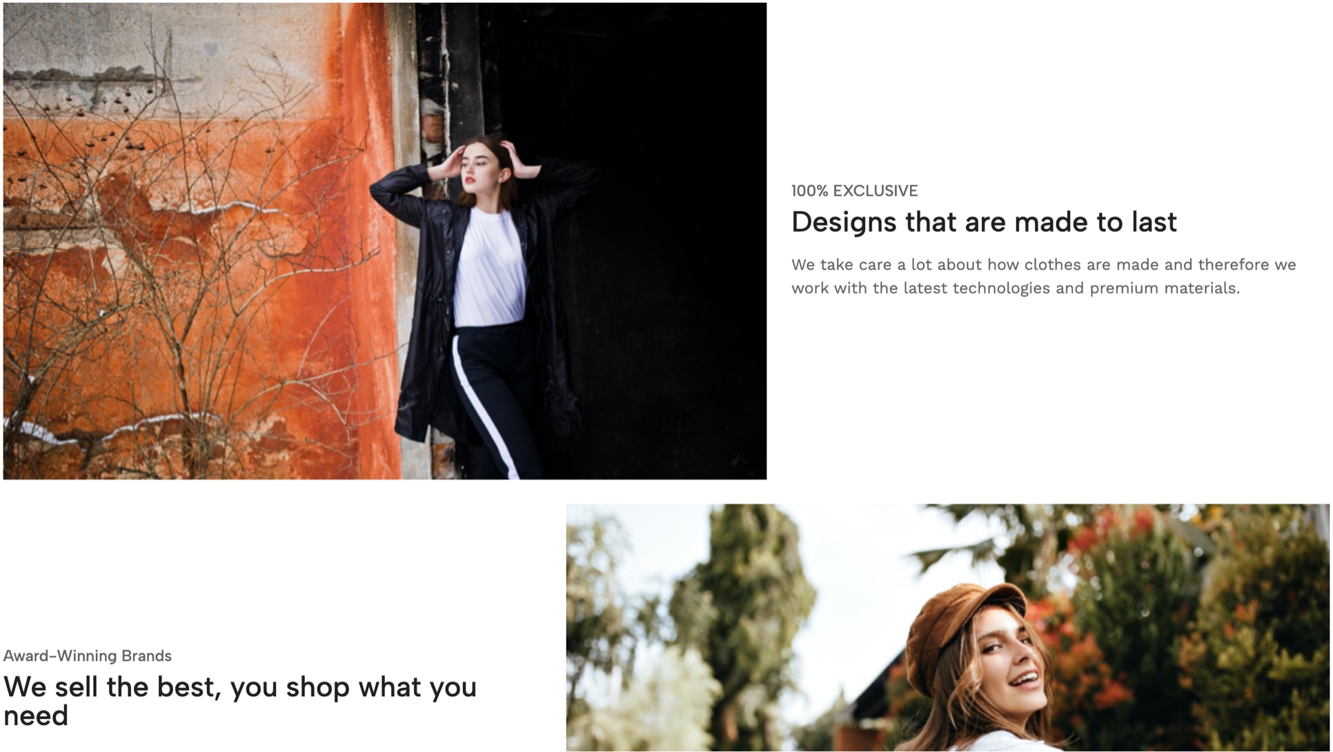
This component allows you to add dynamic content, like for example information about your store with links to pages and/or videos inside a pop-up/modal box that opens on click. Blocks can be displayed in two different styles.
The focus of this component is so you can add very dynamic content to your store and while it was thought to work mainly on pages, like for example an About page, it can be placed on any type of page on Jumpseller and you can use it for anything you want or need.
It works by adding several -as many as you need- subcomponents which we’ll refer to as Blocks. Even though there’s no limit for them, you need to consider that the more you add it will start affecting your store’s loading speed if images are not optimized properly.
Next you can find the detail for all the available options to customize this component, so you can make the most out of it:
Display Type
Allows to define how Blocks will be displayed.
1) Grid
Blocks will be arranged vertically in rows. The image and content of each block will be displayed side to side inside of them, and as they go down both sections will intersperse.
2) Carousel
Blocks will be displayed inside a Carousel and they will hide and show depending on the device type, based on what’s defined at the next option. The image will be displayed first, followed by the content, vertically.
Blocks to show
How many Blocks will be shown in Desktop devices. For tablets devices will always be 2 and for Mobile devices only 1. This option will only work if Display Type is equal to Carousel.
Enable Autoplay
If enabled, Blocks will pass automatically from one to the next based on the speed defined in the option below. Only works if Display Type is equal to Carousel.
Blocks speed
Time that takes to pass from one block to the next, in seconds.
Enable Arrows
Displays next and previous arrows for customers to navigate the Carousel.
Enable Dots
Displays navigational dots (points) for customers to navigate the Carousel.
Enable Heading
Enables a Heading section at the start of the component and before the Block items. It will display if at least one of these fields are filled: Subtitle, Title or Description.
Subtitle
Optional. Subtitle of the section.
Title
Optional. Title of the section.
Description
Optional. Description of the section.
Link
Choose any content of the store, like categories, pages, products, external links, etc.
Link Text
Text that displays in the link. Mandatory if Link is added.
Customize Colors
If enabled, you will be able to customize colors with the options you'll find below. If not enabled, it will consider the colors defined in Themes > Visual Editor > Edit Settings > Theme Colors.
Background Color
Background color of the section. This is the only color that can be modified without having to enable Customize Colors.
Subtitle color
Color for the subtitle of the section.
Title color
Color for the title of the section.
Description color
Color for the description of the section.
Link Color
Color for the text of the link.
Top margin
Allows to add a margin at the top of the section to separate it from other components.
Bottom margin
Allows to add a margin at the bottom of the section to separate it from other components.
Top inner margin
Allows to add an inner margin at the top of the section to generate more space between the content and the background.
Bottom inner margin
Allows to add an inner margin at the bottom of the section to generate more space between the content and the background.
Flexible Content Block
This is the Subcomponent for the Flexible Content component. For each Block to be displayed properly you need to add at least the following:
- Mobile or Desktop images, although as we have already explained throughout this documentation, we suggest you add both.
- Title is mandatory, but we suggest you also add a Description as it will provide a bit more context to the block.
Next are all the options available to customize this subcomponent:
Image (mobile)
Mandatory. Image for mobile devices with a minimum suggested width of 552px and in .jpg format.
Image (desktop)
Mandatory. Image for desktop devices with a minimum suggested width of 750px and in .jpg format.
Video
Copy and paste here the embedded object from the source you need or the URL, for example Youtube or Vimeo.
This will make that when clicking the image or the link (if visible), the video will open in a Pop-up modal window.
Content Alignment (for Mobile)
Allows to define the alignment for the content of the Block on Mobile devices.
Content Alignment (for Desktop)
Allows to define the alignment for the content of the Block on Desktop devices.
Subtitle
Optional. Subtitle of the block.
Title
Mandatory. Title of the block.
Description
Optional, but ideal. Add a description for the block.
Link to page
Allows to choose any content of the store, like a page, category, product or external link. Not applicable if the Block will be used for a Video.
Link Text
Text that will be displayed on the link. If you leave this field empty and the block will be used for a Video with Enable Video Link enabled, the text "See Video" will be displayed by default.
Enable Video Link
Allows to make the Link that opens the Pop-up modal window visible. If not enabled, the Video will still be able to be opened when clicking on the block image.
Link Icon
Displays an icon along with the Link text. If a video it's defined, it will be a play icon before the text. If it's a link to a page, there will be a right arrow after the text.
Subtitle color
Color for the subtitle of the block.
Title color
Color for the title of the block.
Description color
Color for the description of the block.
Link color - Text
Color for the text of the Link.
Link color - Text (hover)
Color for the text of the Link in hover state (when passing the mouse over).
Testimonials
- Live examples:
- Testimonials Example
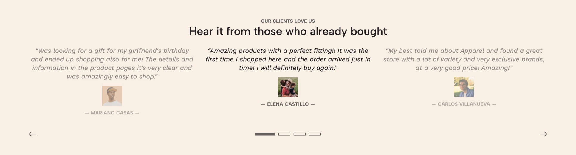
This component allows to display testimonies, feedback or comments from customers in your store. This is helpful to build trust in your brand and for example, give first time customers more information regarding your products or anything else you may think it’s worth displaying.
It works by adding as many Testimonies as you want (subcomponent) within a Carousel element for better performance in all devices, especially in Mobile.
Next are all the options available to customize this component:
Testimonies to show
How many testimonies will be visible in Desktop devices. For tablet devices it will always be 2 and for Mobile devices only 1.
Enable Heading
Enables a Heading section before the Testimonies Carousel. Even if this is enabled, it will only appear if at least one of the following fields are added: Subtitle, Title or Description.
Subtitle
Optional. Subtitle of the section.
Title
Optional. Title of the section.
Description
Optional. Description of the section.
Link
Optional. Choose any content of the store, like categories, pages, products, external links, etc.
Link Text
Text that displays in the link. Mandatory if Link is added.
Enable Autoplay
If enabled, testimonies will pass automatically from one to the next based on the speed defined in the option below.
Carousel speed
Time that takes to pass from one testimony to the next, in seconds.
Enable Arrows
Displays next and previous arrows for customers to navigate testimonies.
Enable Dots
Displays navigational dots (points) for customers to navigate and choose testimonies to see.
Customize Colors
If enabled, you will be able to customize colors with the options you'll find below. This applies as well for each testimony that's gonna be added. If not enabled, it will consider the colors defined in Themes > Visual Editor > Edit Settings > Theme Colors.
Background Color
Background color of the section. This is the only color that can be modified without having to enable Customize Colors.
Subtitle color
Color for the subtitle of the section.
Title color
Color for the title of the section.
Description color
Color for the description of the section.
Link Color
Color for the text of the link.
Testimony Block - Quote color
Color for the Quote of each testimony.
Testimony Block - Author name color
Color for the Author name of each testimony, if added.
Top margin
Allows to add a margin at the top of the section to separate it from other components.
Bottom margin
Allows to add a margin at the bottom of the section to separate it from other components.
Top inner margin
Allows to add an inner margin at the top of the section to generate more space between the content and the background.
Bottom inner margin
Allows to add an inner margin at the bottom of the section to generate more space between the content and the background.
Testimony
This is the subcomponent for the Testimonials component. Even when there are only a few options available, it’s important that you try to use most of them, as it can have a positive impact especially for first time customers that will visit your store.
Next are all the options available to customize this subcomponent:
Quote
Mandatory. Add the client Testimony. Maximum 400 characters.
Image / Avatar
Optional. Upload an image to accompany the name of the Author. Image will be displayed at a maximum size of 50x50px.
Author name
Optional, but ideal. Add the name of the person who gave the quote. Can be the full name, just the first name, an alias, etc.
Logo Carousel
The main focus for this component and the reason it was designed for is to display Logos that are or can be related to “Brands” that you may have available at your store.
These brands are commonly done by creating categories, like for example if you had a clothing shopping store you could have the following:
- Nike
- Adidas
- New Balance
- Reebok
Based on the previous list, each of those brands would be categories in your store which also would have a Logo that can be displayed in the component’s Carousel.
Although this is the main focus, it can be used to display anything you want or need. Next you can find all the options available to customize this component:
Logos to show
How many logos will be visible in Desktop devices. For large tablets devices 4 logos will be visible, for small tablets devices 3. For Mobile devices 2 logos will always be visible.
Enable Autoplay
If enabled, logos will pass automatically from one to the next based on the speed defined in the option below.
Carousel speed
Time that takes to pass from one logo to the next, in seconds.
Enable Arrows
Displays next and previous arrows for customers to navigate the Carousel.
Enable Dots
Displays navigational dots (points) for customers to navigate the Carousel.
Enable Heading
Enables a Heading at the start of the section, before the Carousel. Even if this is enabled, it will only appear if at least one of the following fields are filled: Subtitle, Title or Description.
Subtitle
Optional. Subtitle of the section.
Title
Optional. Title of the section.
Description
Optional. Description of the section.
Link
Optional. Choose any content of the store, like categories, pages, products, external links, etc.
Link Text
Text that displays in the link. Mandatory if Link is added.
Customize Colors
If enabled, you will be able to customize colors with the options you'll find below. If not enabled, it will consider the colors defined in Themes > Visual Editor > Edit Settings > Theme Colors.
Background Color
Background color of the section. This is the only color that can be modified without having to enable Customize Colors.
Subtitle color
Color for the subtitle of the section.
Title color
Color for the title of the section.
Description color
Color for the description of the section.
Link Color
Color for the text of the link.
Top margin
Allows to add a margin at the top of the section to separate it from other components.
Bottom margin
Allows to add a margin at the bottom of the section to separate it from other components.
Top inner margin
Allows to add an inner margin at the top of the section to generate more space between the content and the background.
Bottom inner margin
Allows to add an inner margin at the bottom of the section to generate more space between the content and the background.
Logo
This is the Subcomponent for the Logo Carousel component. Here you can upload the image for your Logo (or Brand) which is mandatory, therefore, the subcomponent won’t display if no image is uploaded.
Logo / Image
Mandatory. Upload a Logo or Image considering the following suggestions:
- Suggested width size: 200px.
- Suggested format:
.jpg - If you upload it in
.pngformat, make sure to optimize it as best as possible without compromising its resolution or risk pixelating.
Link
Choose any content of the store, like categories, pages, products, external links, etc. As it was explained at the beginning of the Logo Carousel component introduction, this will be probably a category of your store.
Link Text
This text displays when the user hover (passes the mouse over) the Logo. It's useful to improve your store's SEO and also it can help enhance your store and make it compliance for people with hearing disabilities.
Lookbook
- Live examples:
- Lookbook Example 1
- Lookbook Example 2

This component allows you to create a Lookbook composition with different images that adapt within the page grid. You can upload a maximum amount of 20 items that must be within the following intervals: 2, 3, 4, 6, 8, 9, 10, 12, 15, 16, 18, 20. Additionally, you can add a Heading for the section with a Subtitle, Title, Description and Link to any page of your store.
There are a few key factors that’s important for you to consider when adding this component:
Intervals
This means that if you upload an amount of images that are not within the intervals mentioned before, it will most likely that some spaces of the composition will or can be left blank. These are the intervals that are not recommended to be used: 1, 5, 7, 11, 13, 14, 17 and 19.
Images adaptation
Based on how this component works in the background (hence, the code), images will adapt to the available space when images start arranging themselves to make the composition. Because of that, it’s important that the main focus for all images is at the center of each one. You can see a few examples of how this is interpreted and how images will look and fill the space:
Heading
As it was explained at the beginning of this documentation, you can enable a Heading section that contains the following optional elements for being added: Subtitle, Title, Description and Link.
Next you can find all the options available to customize this component:
Enable Heading
Enables a Heading at the start of the section, before the Lookbook gallery of items. Even if this is enabled, it will only appear if at least one of these fields are filled: Subtitle, Title or Description.
Subtitle
Optional. Subtitle of the section.
Title
Optional. Title of the section.
Description
Optional. Description of the section.
Link
Optional. Choose any content of the store, like categories, pages, products, external links, etc.
Link Text
Text that displays in the link. Mandatory if Link is added.
Customize Colors
If enabled, you will be able to customize colors with the options you'll find below. If not enabled, it will consider the colors defined in Themes > Visual Editor > Edit Settings > Theme Colors.
Background Color
Background color of the section. This is the only color that can be modified without having to enable Customize Colors.
Subtitle color
Color for the subtitle of the section.
Title color
Color for the title of the section.
Description color
Color for the description of the section.
Link Color
Color for the text of the link.
Top margin
Allows to add a margin at the top of the section to separate it from other components.
Bottom margin
Allows to add a margin at the bottom of the section to separate it from other components.
Top inner margin
Allows to add an inner margin at the top of the section to generate more space between the content and the background.
Bottom inner margin
Allows to add an inner margin at the bottom of the section to generate more space between the content and the background.
Lookbook Item
This is the Subcomponent for the Lookbook component and it’s very basic in terms of what you need to do and what you can add, we will refer to it as Item.
The item will be visible once you upload any of the two images, but we recommend you upload both because of small performance issues you may encounter by not doing so. A few examples of these “small issues” could be:
- Uploading only the Mobile image and risk the chance of it pixelating on Desktop devices when trying to fill the available space.
- Uploading only the Desktop image and because it’s very likely that its size will be heavy, it can affect the page loading speed on Mobile devices.
Next you can find the following two options to upload images for the subcomponent:
Image (mobile)
Image for mobile devices. We suggest you upload it with a maximum recommended width of 575px and in .jpg format.
Image (desktop)
Image for desktop devices. We suggest you upload it with a minimum recommended width of 700px and in .jpg format.
Pop Up
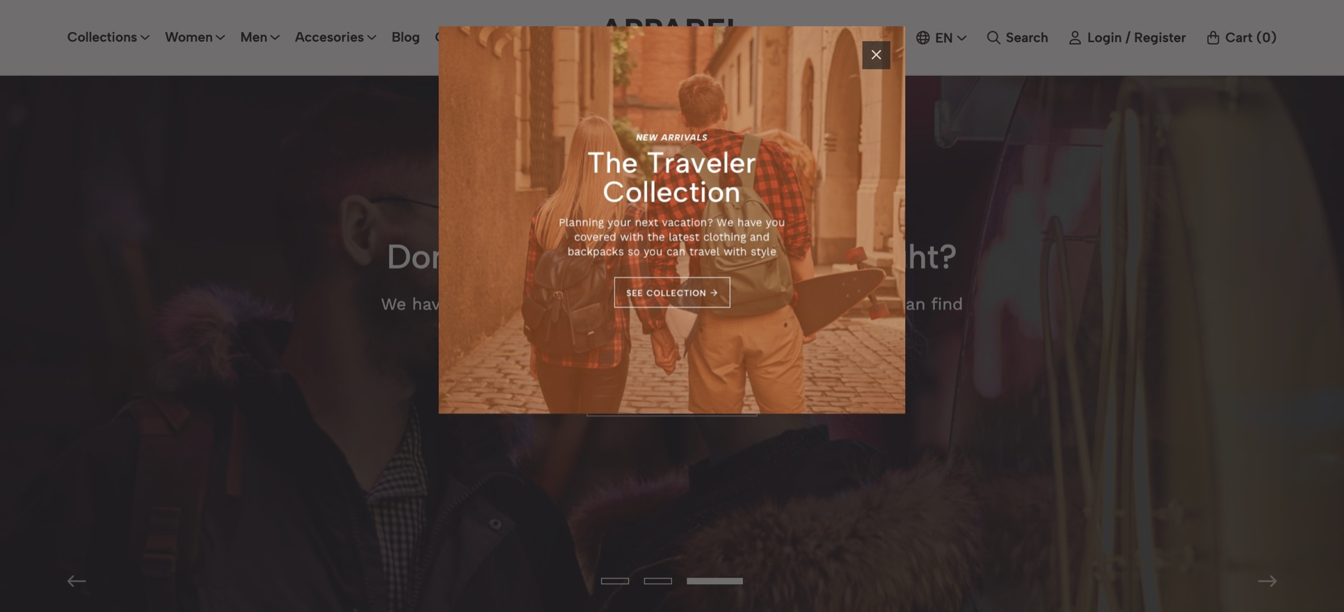
This component allows you to display a Pop Up element, which can be set to appear within a certain amount of time once the store has finished loading. It will display as long as one of the following items are added: Title, Content or Image.
This is useful for displaying messages that you want your customers to pay attention to or that contains relevant information about a specific subject.
The available options for you to customize this component are the following:
Time to display
Allows you to define how much time will pass before the Pop Up displays.
Type
Allows to select between two Pop Up ways in which this can be displayed, which will defer on what elements will be visible:
- Image Only: Only the image will be displayed along with the
close iconon top of it. A few points on this that need to be considered are:- If you have added a Title, it will display before the image.
- If you have added Content, this will not display. For that, consider choosing the next option.
- Image + Content: This option will display everything you have added to the Component.
Remove margins
If enabled, the Pop Up container will be transparent and therefore the option Background color will not be applied nor considered.
Width Size
Allows you to define the maximum width size the Pop Up will have. This will adapt depending on the device type where it's being seen.
The width of the image will depend on the width of the Pop Up element you have defined. Next we leave you a table with estimated widths for you to choose what’s best:
| Pop Up Width Size | Pop Up maximum Width in pixels | Image optimal width |
|---|---|---|
| Small | 300px | 300 px minimum |
| Normal (default) | 500 px | 500 px minimum |
| Large | 800 px | 800 px minimum |
| Extra Large | 1140 px | 1140 px minimum |
| Fullscreen | Browser width | Consider adding a big image, like for example 1600px wide |
Title
Optional. If you don't add one, the close icon (x) will be positioned on top of everything, at the top right corner of the Pop Up.
Image
Image that can be displayed along with the content or alone, if Type is equal to Image Only.
Pop Up. Also, ideally upload it in .jpg format.Image position
Allows you to define the position in which the image will be displayed:
- Before the content (default): The image will be displayed before the content you add and after the
Headingsection. - After the content: The image will be displayed after all the content you add.
Content
Here you can add the content of the Pop Up, which allows HTML markup that can be useful to emphasize certain texts. You can read more about how to add HTML tags in our Tips & Tricks section.
Content Alignment
Allows you to define the alignment for the content:
- Left: All content will align to the left side of the
Pop Upwindow. - Centered: All content will align to the center of the
Pop Upwindow.
Link
Choose any content of the store, like categories, pages, products, external links, etc. A link (button) will be displayed at the end of the Pop Up container, after the content and the image, if any of these are added.
Link Text
Text that displays in the link. Mandatory if a Link has been added.
Enable Link Arrow
Displays an arrow at the right side of the link text.
Link on Image
If an image has been added, this will make it clickable.
Customize Colors
If enabled, you can customize colors with the options you'll find below. If not enabled, it will consider the colors defined in Themes > Visual Editor > Edit Settings > Theme Colors.
Background color
Color for the background of the Pop Up container.
Heading color
The Heading is the section that contains the Title and the close icon (x).
Title color
This color also affects the close icon (x) when the Title has been added. If not added, the close icon will be white with a black background so it can be completely visible regardless of any content, image or colors you define.
Content color
Color for the content of the element.
Close icon color
Color for the "x” symbol of the close icon. Will only apply if Type is equal to Simple.
Close icon background
Background color for the close icon. Will only apply if Type is equal to Simple.
Accordion
- Live examples:
- Accordion w/ groups
- Accordion without groups
The focus and purpose of this component is to display content on a page within collapsible pieces of information, which can be opened and closed on click. We will refer to them as Items.
This is useful if for example you want to publish information at a Frequently Asked Questions page, but you don’t want to have an extremely extensive amount of content in it. The are some key factors that you need to consider when working with this component:
Groups
The default settings for the Component will be to group items within a single accordion element. Nonetheless, you can define that items are grouped within different or multiple accordions, in order to divide the information in better way, if you find it necessary.
Heading
The component can display a Heading section that will be visible as long as add at least the Title for the section or the Description. If none of those fields are filled, it will only display the Accordion(s).
The available options for you to customize this component are the following:
Accordion Width
Allows to define the width for the section, where 100% will be the full width of the store's grid. This won't be applied if you have defined that items will be divided into groups.
For static pages (e.g. Terms and Conditions or Legal pages) even if you have defined that items are divided into groups, each accordion will stretch to the 100% available space of the container where it has been placed.
Title
Optional. Allows to add a Title that will display before the accordion(s).
Description
Optional. Allows to add a Description that will display below the Title (if added).
Link
Optional. Choose any content of the store, like categories, pages, products, external links, etc.
Link Text
Text that displays in the link.
Group items
Allows to group items based on topics or subjects. Each group will be displayed in different columns that will contain its respective items. In order to define groups, you just need to add the name for each one in this field and separate them with commas (,), like for example: Shipping,Payments,Other.
Force Groups to full width
By default groups will be placed in 2 columns (if two groups exist) or in 3 columns (if more than two groups exist). With this option you can force that they stack one below the other and that each one take 100% of the available space.
Customize Colors
If enabled, you can customize colors with the options you'll find below. If not enabled, it will consider the colors defined in Themes > Visual Editor > Edit Settings > Theme Colors.
Background Color
Background color of the section. This is the only color that can be modified without having to enable Customize Colors.
Title color
Color for the title of the section.
Description color
Color for the description of the section.
Link color
Color for the link of the section.
Top margin
Allows to add a margin at the top of the section to separate it from other components.
Bottom margin
Allows to add a margin at the bottom of the section to separate it from other components.
Top inner margin
Allows to add an inner margin at the top of the section to generate more space between the content and the background.
Bottom inner margin
Allows to add an inner margin at the bottom of the section to generate more space between the content and the background.
Accordion Item
This is the Subcomponent for the Accordion component and allows you to add as many as you want with different types of information inside. We will refer to the as Item(s).
In order for Items to be displayed, you need to add the Title, otherwise, they will not be displayed at all.
The options for you to customize this subcomponent are the following:
Title
Mandatory. Title for the accordion item.
Content
Optional, but ideal. Content (or description) for the accordion item.
Image
Allows to add an image along the content of the accordion item.
Image position
Allows to define where the image will display:
1) Before the content
The image will display before the information you add at the Content field.
2) After the content
The image will display after all the information you add at the Content field.
3) Between the content
The image will be displayed within the information of the Content field. For this to work you need to include the [image] tag inside the Content field, at the position you want it to be displayed.
Item Group Name
If you have defined that items will be grouped by enabling the option Group items, you need to add the Group name here. The item can only belong to one group.
