Apparel Theme - Basics
In this section we will lay out some topics and definitions that are gonna be used and that you will find throughout all the options available in the Visual Editor administration panel. We encourage you to read this so you can understand as best how you can take advantage of all the options available in this theme.
Mobile First
This theme has been designed and codified to be Mobile First and you may wonder what that means, cause perhaps you might have heard of the term or someone mentioned it. You can of course make a brief Google search with that term and you will find an extensive list of articles about it, but for the sake of simplicity we will give you a small explanation here.
Mobile First is the tendency and best practice today that most companies and freelancers implement to design a website (or store in this case) because -as it names says it- the priority is to work and perform best on Mobile devices first. The reason for this is pretty much simple and is based on real data: Visits at your store will be from Mobile phones in an approximate of 80%, if not higher. Which means that your priority should be that your store loads and performs the fastest possible there, so your customers can navigate it easily.
For what regards to this Theme, we suggest that you prioritize efforts in that direction, like for example optimizing and uploading images for Mobile devices first and then for Desktop, because they will be the piece of content that’s gonna take care of the most part of your store’s speed loading time.
Placeholders
All components of the theme have by default what we call Placeholders. This is an example configuration that allows you to preview how the component will look before adding real content.
As it's explained in detail at the Theme Components section, you will be able to see that when you apply the theme to your store, some components come already preinstalled. These components will have placeholders as they will not have real content until you start adding something. This will also happen for other components as you start adding them to your store’s pages.
Store Logo
You can upload a Logo -let’s call it Main Logo- that will display on most parts of your store at Settings > General > Preferences. This Logo will display for example at the Header of your store, the Footer and at the Order Emails like the "Paid Order".
Regardless of that and to give you more control over how you want to design your store, in some sections of the Visual Editor you will find options to upload another Logo for specific sections. We thought of it this way because it can happen that the Main Logo doesn’t always fit perfectly with some sections of the store. Let’s take the following example:
.jpg format with a white background (generally .jpg images don't give the option to have a transparent background). Now let’s imagine you change the background color of the Header to black. Probably that wouldn’t look good at all, right? If these specific options wouldn’t be available, you will be stuck with that or you would have to make the Header background white in order to adapt the Main Logo.
Also, for these specific logos we suggest that you upload them in .svg format, which are vectors and the key reason for this is that SVG files/images don't pixelate! Therefore, they will always look good considering that most browsers and devices nowadays don't have any problem at all displaying these types of file formats, which wasn’t the case a few years ago. If you don’t know how to export to SVG or prefer another format, you can upload them in PNG with transparency.
Finally, for some custom Logos -if not all- you will find a list of available heights to define, with a range that goes from 10px to 120px. We made it this way to prioritize the design layout, the overall functionality and the “look & feel” of your store. Mainly because if you upload a logo that has an extreme height size, there’s a 99.9% probability of breaking your store’s design and/or the section where it’s gonna be displayed.
Logos formats example
Next you can find a few examples on how logos look and vary depending on the file type in which they are exported.
If you pass your mouse over them their size will slightly expand and you will be able to see how .png and .jpg formats "pixelate" a bit, while the logo in .svg format don't.
SVG
PNG
JPGColors
All Selgud themes come with a Theme Colors section that will allow you to change or modify all the theme colors to fit your brand guidelines and design.
With that in mind, you will also find that several sections of the Visual Editor and for Components as well, display an option to Customize colors that can be enabled, along with the several color options for certain elements that those colors will affect.
Based on the previous explanation, we detail here a bit about how colors work on the theme:
Theme Colors
All the colors here are the “base” colors of the theme, so if you change any of them, it will affect several sections and/or elements where that color is applied.
Customize Colors
If you enable that option on the sections where it’s available, those colors will gain priority on top of the Theme Colors.
Header

The Header is the section that acts as your store’s main navigation and contains elements that are crucial for customers to move through your store. You can find the settings and configurations for the Header on this part of the documentation.
The Header, like many other sections of the store, is divided into columns that group several key elements together. We will explain in detail each of them:
The Brand section
This section is where your Store’s Logo displays, or your Store’s Name if you haven’t defined a Logo. It will always be aligned to the center of the page.
The Desktop Menu section
This section it’s only visible for Desktop devices that have a width equal or greater than 1200px. It displays the menu available at Customization > Navigation > Main Menu and its items and subitems. It will hide for devices with a width that’s less of the dimension mentioned before.
The Toolbar section
This section is the one positioned at the right side of the Header and contains several elements that can be displayed:
Currency dropdown menu
If you have defined two or more currencies for your store, this item will display. By default it will have the Main currency of your store and by clicking on it customers will be able to see all the other currencies you have added.
This item will only be visible for Desktop devices that have a width equal or greater than 1200px. For devices less than that, it will hide from the Header but will be accessible on the Mobile Menu, which is fully explained later on this documentation.
You can add additional Currencies to your store by going to Settings > General > Preferences > Currency. To know more about how Currencies work in your store, you can read the following Jumpseller article.
Languages dropdown menu
If you have defined two or more languages for your store, this item will display. By default it will have the Main Language of your store and by clicking on it, customers will be able to see all the other languages you have added.
This item will also be only visible for Desktop devices that have a width equal or greater than 1200px. For devices less than that it will hide from the Header but will be accessible on the Mobile Menu, which is fully explained further below on this documentation.
You can add additional Languages to your store by going to Settings > General > Languages. To know more about how Languages work in your store, you can read the following Jumpseller article.
The Search item
This item is the one that allows to open the Pop Up or Modal window that contains the respective field for your customers to search products in your store. This element is explained in detail further below in this documentation.
The Login/Register item
This item is the one that takes customers to the Login page of your store, which has the respective link for customers to Create an account. This item will always be visible for all device types.
The Cart item
This is one of the most important elements of the Header of your store, because it dynamically displays the amount of products (products count) customers have added to the Cart and also because it opens the Sidebar Cart panel that has the full detail of the order of your customers, such as products, totals and the links that allow customers to go to the Checkout or Cart pages.
The Sidebar Cart panel is explained in full detail in its respective section further below this documentation.
The Mobile menu section
This section it’s only visible for devices that have a width equal to or less than 1199px and it’s positioned on the left side of the Header. It displays the following two elements:
The Menu item
This item is the one that opens the Mobile Menu panel, which is explained in its respective section further below this documentation.
The Search item
This item is the same that was explained above, because it moves from one section to another depending on the device type.
Header Icons and Texts
You will be able to notice that all elements display an icon and a text. The icon is the one element that will always be visible on all devices. All texts, except the “products count”, will hide for devices that have a width equal or less than 767px, like for example an iPad Mini, which is a Tablet. This behavior is intentional to prevent -or try to- items from collapsing on smaller devices.
Store Grid
Mostly every website (or store for this purpose) uses some kind -of what’s known as- Framework. For the sake of simplicity, a Framework is a software designed to support the development of a website, which may or can include styles for elements like buttons, links, titles and text sizes, etc. All Selgud themes work with one of the most known and advanced frameworks in the market: Bootstrap.
The Grid of a store (or website) is the layout that defines the available and maximum width space for the majority of its elements, and therefore, it can constrain sections to have a width based on those predefined dimensions. In the case of Bootstrap, there are two available width sizes:
- Container Fluid: This will extend all containers to the maximum width of the browser where you’re visualizing the store.
- Container: This will extend all containers to a maximum width of approximately 1300px wide.
On several options of this theme you will find the ability to choose the width of certain sections, based on two options that correspond to the ones mentioned before:
1.- Browser Width <> Container Fluid
In the image above the Slider component has been defined to take the full width of the browser window.
2.- Grid Width <> Container
In the image above the Slider component has been defined to take and respect the width of the maximum container width.
The last one it’s useful if for example you don’t want sections and most importantly images, to go as far as the browser allows them to, because that could mean that images could get pixelated by trying to stretch and respect the browser’s width. Let’s look at an example:
Let’s say you’re visiting a store on an iMac computer where the browser has a width of 2400px. Now, imagine that this store has a Banner that has a width of 1600px. This would result in the image trying to fill the maximum available space (2400px), and therefore, it would ideally need to have 800px more than its original dimension. But as it doesn’t, then it will look pixelated -and not very nice-.
Because of the previous example, you will find one option -we'll let you know where- from which you can define the maximum width that the Store’s Grid will have, in order to prevent cases such as this.
That way, your store can look as beautiful as you want and you don't have to worry about uploading humongous and heavy images that can negatively impact your store’s loading speed.
Images and Alternative texts
For Components and Subcomponents that allow you to upload images -in some cases for both Mobile and Desktop devices- you will notice that once you upload the file, a field below of it will appear with a text that says “Alternative text”.
The text you can add in this field is really important, as it will be placed through code inside the image and it can help you improve your store’s SEO.
So we suggest that you do it whenever it’s possible. You can read more about how SEO works in our Tips & Tricks section.
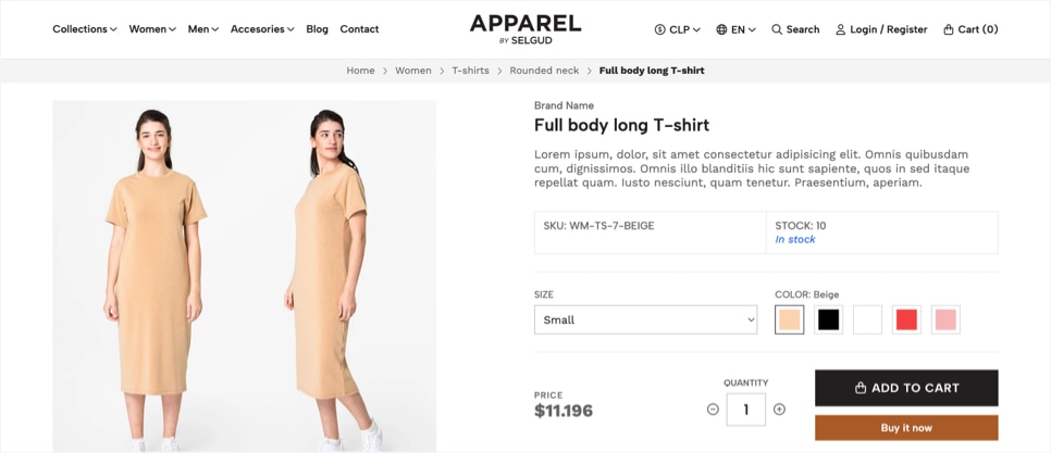
Heading
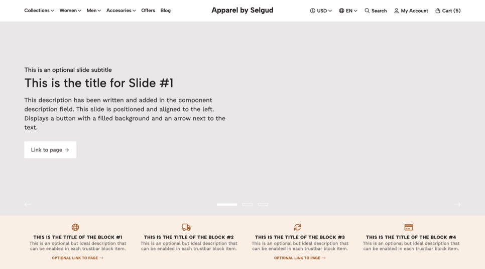
You may find in some components an option to enable a Heading. This section is the one that contains 4 elements that are important for any page (or section), as they go before the content of the component and can help a lot to give context. These elements are: Subtitle, Title, Description and Link.
There are some pages that also have a Heading, which for these cases cannot be hidden. These pages are for example:
Product pages
The section that contains the Product Brand, the Product Name, the Product Price and the Product Description.
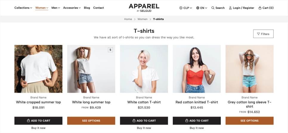
Category pages
The section that contains the title or category name, and if added, the category description. As well as the Filters button that opens the filters sidebar panel.
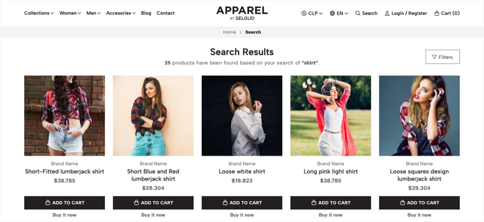
Search Results page
The section that contains the title of the page and depending on the search results found, a description with a bit of detail. Here if available, the filters button will also be displayed.
Pages
For example a Terms and Conditions page is mainly composed of a Title and the Body (or description if you may). In this case the Title would be the Heading.
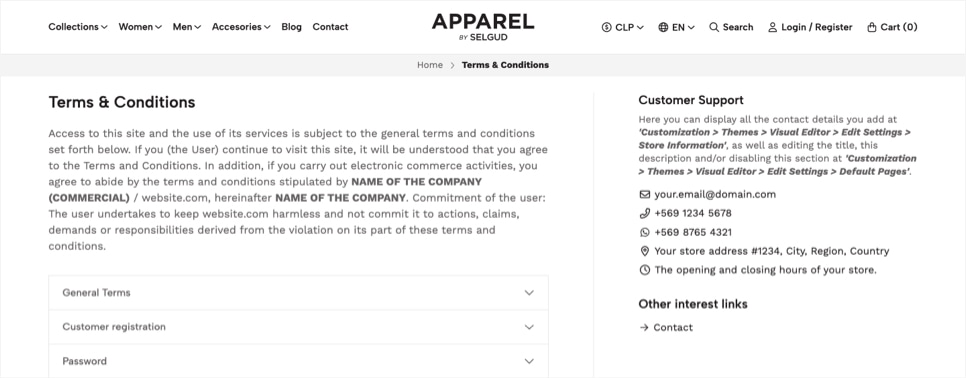
Margins
On mostly all Components of this theme, as well as some sections of the Visual Editor at the Edit Settings part, you will find four options that will allow you to modify margins.
We added this in order for you to have more control over your store’s design and how components and sections interact with each other.
Next you can find an example that details how each margin affects a component and/or section:
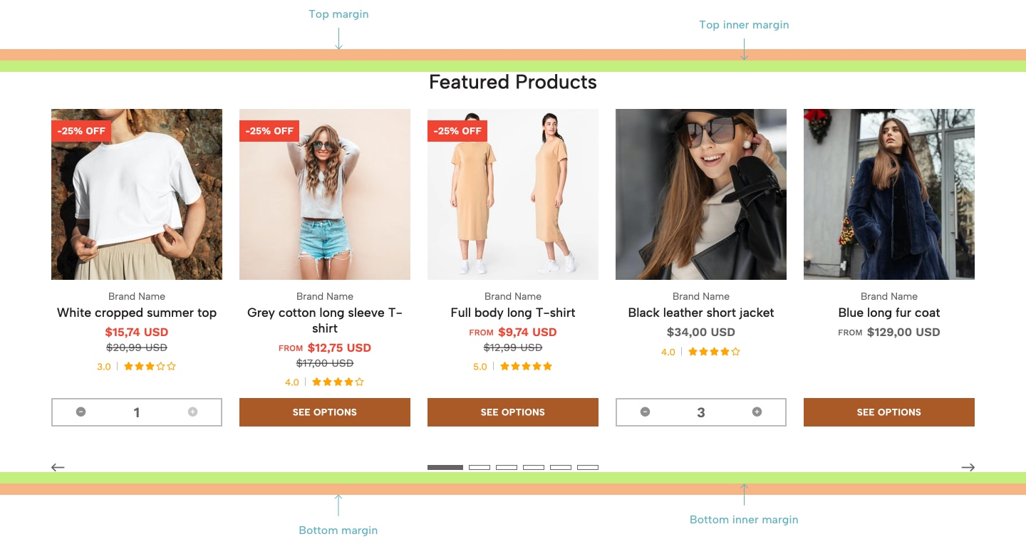
Featured Products component.Green lines
Are the inner (top and bottom) margins that allow separation of the content (e.g. Heading, like Featured Products title) with the upper and lower parts of the component. This can be more visible and best understood if the component has a background color different from white.
Orange lines
Are the top and bottom margins -outer, if you like- that allow to separate and create space (commonly referred as “white space”) between the component and other sections (or components) that appear before or after.
Product Block
The Product Block is the preview for all products of your store. You can see this block on several pages of the store, like the following:
- On the Homepage where you have added Components like for example the
Featured Products. - On Category pages
- On the Search Results page
- On the sections within the Product page like for example
Related ProductsorRecommended Products.
For some pages and components you will be able to define how products are gonna be displayed, based on two options: Carousel or Grid. You can see a full detail of how each one of these options works and how many products will be visible depending on the one you choose:
1) Carousel
The amount of products that will be visible on the Carousel will vary depending on the device where the store is being seen, based on the following table:
| Device width (pixels) | Amount of products (on view) |
|---|---|
| < 320px | 1 |
| < 575px | 2 |
| < 767px | 3 |
| < 991px | 4 |
| > 992px | 5 |
2) Grid
The amount of products per horizontal row will vary depending on the device where the store is being seen, based on the following table:
| Device width (pixels) | Amount of products (per row) |
|---|---|
| < 320px | 1 |
| < 575px | 2 |
| < 767px | 3 |
| < 991px | 4 |
| > 992px | 5 |
Icons
You will find along the theme that some options allow you to select or add icons to certain components, sections and/or elements/items of the store. These icons come from the FontAwesome library that is already integrated with Jumpseller and within the theme, which has more than 10.000 icons to choose from.
In most parts where you can or will have to select an icon, you will also have the ability to choose from 5 or 6 styles (Icon style). You can see examples on how styles are differentiated one from another in the tables below.
| Icon / Icon Style | Duotone | Light | Regular | Sharp | Solid | Thin |
|---|---|---|---|---|---|---|
| Truck | ||||||
| Shopping Cart | ||||||
| Credit Card | ||||||
| Envelope |
| Brands* / Styles | Normal | Square | Alternative |
|---|---|---|---|
| Youtube | |||
| TikTok |
style option, you will always have to select Brands, otherwise the icon will not be displayed as it should.For certain options you will be only able to select from within a limited list of icons, like for example the Header Cart icon. This has been done that way to make it easier to find the most proper icons of that type, so you don’t have to be looking for the one that could fit.
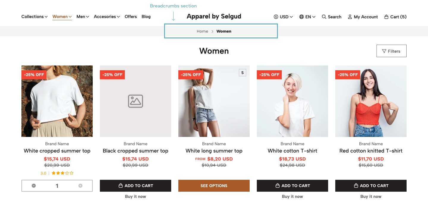
Breadcrumbs
This section is the one that can be visible on mostly all pages of your store and that allows customers to go back and forth between them. It’s called that way basically because it lays out the “route” that customers went through for arriving at a specific page or content and allows them to click and go back to the pages they came from.
Shopping Process
All customers must go through 4 pages in order to make an order at your store, being the fourth page the final one. The first 3 pages are divided into two main sections, one on each side for Desktop devices (left and right) and stacked vertically for Mobile devices (top and bottom). We will refer to both sections this way: Content and Summary, respectively.
Summary sections include the Totals subsection, which is the one that informs customers about all the details regarding their current order like the Products (amount/quantity), Subtotal, Shipping cost, Taxes, Discounts and Total of the order. It also includes the button to go to the next step of the process and links -depending on the page they’re at- to go back to previous pages and/or “Keep shopping” by going to the Homepage of your store.Checkout version 1. All stores, when created, come by default and pre-installed with the latest version of Jumpseller's Checkout, which is called Checkout version 2, which cannot be edited or modified.You can read more about the differences between each Checkout version, its functionalities and details in the following Jumpseller article.
Next you can find the detail for each Shopping process page:
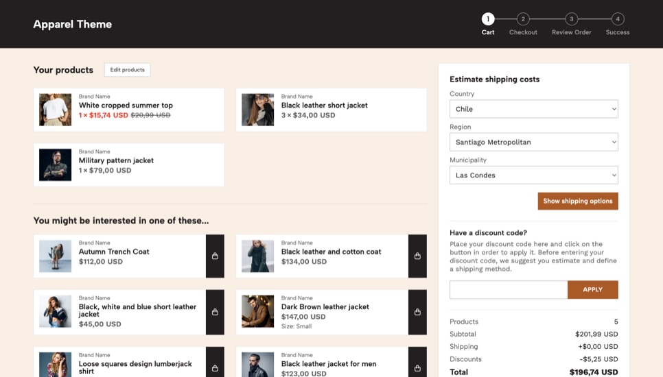
1.- Cart
This page is the first one and presents the customer with the products they have added on the Content section, where they can edit the product’s quantities and/or remove them.
At the Summary section the following subsections are available:
- Estimate Shipping: Allows customers to see all the available shipping methods you have defined at the store, always based on the country, region and municipality configuration you have set.
- Discounts codes: If you have created a
Promotionon your store and it works by adding a Promotion Code in order to be applied, the respective section will display. - Totals: As it was mentioned before, this subsection contains all the details regarding the monetary numbers of the order.
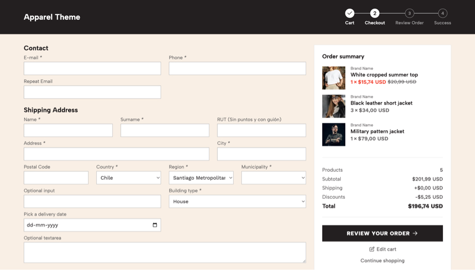
2.- Checkout
This is the second page of the shopping process and at the Content section it displays the Checkout form, which is the one customers have to fill in order to move to the next section. This form is divided into the following subsections:
- Contact Information: Here the customer must add their email address (mandatory and cannot be removed) and phone number (which you can enable or not).
- Shipping Information: Here the customer must add all the information to where the order will be shipped to.
- Billing Information: Here customers can add different information for the Billing if they want it to be different from the Shipping. By default this will be hidden, but can click on a checkbox in order to open it and fill the respective fields.
- Other: An additional subsection can be displayed that contains a field that comes by default to add “Special instructions” for the order.
- Payments methods: This subsection presents the list of available payment methods for your customers to choose from.
- Shipping options: This subsection presents the list of available shipping methods for your customers to choose from. This list it’s completely dynamic, meaning that each Shipping method will display its price. Every time they change any of those select values, prices will change and update, depending on the Country, Region and Municipality they have selected.
Additionally, you can add all the fields you want or need on any of these sections, from different types, like text input, select lists, checkboxes, radio buttons and textareas. This will allow you to have a more customized Checkout form, where a few examples could be:
- Gift checkbox field: Add a “Checkbox” type additional field so your customers can choose if they want their order to be a Gift.
- Delivery Date field: Add a “Date” type additional field so your customers can select a date on which you need to deliver the order.
In the Summary section customers will find the list of products they have in their Cart, but they won’t be able to edit them. This is intentional, as the focus is that if they get to this part, they finish the process. If they need to edit products, they can go back to the Cart page. The Totals subsection it’s also available here.
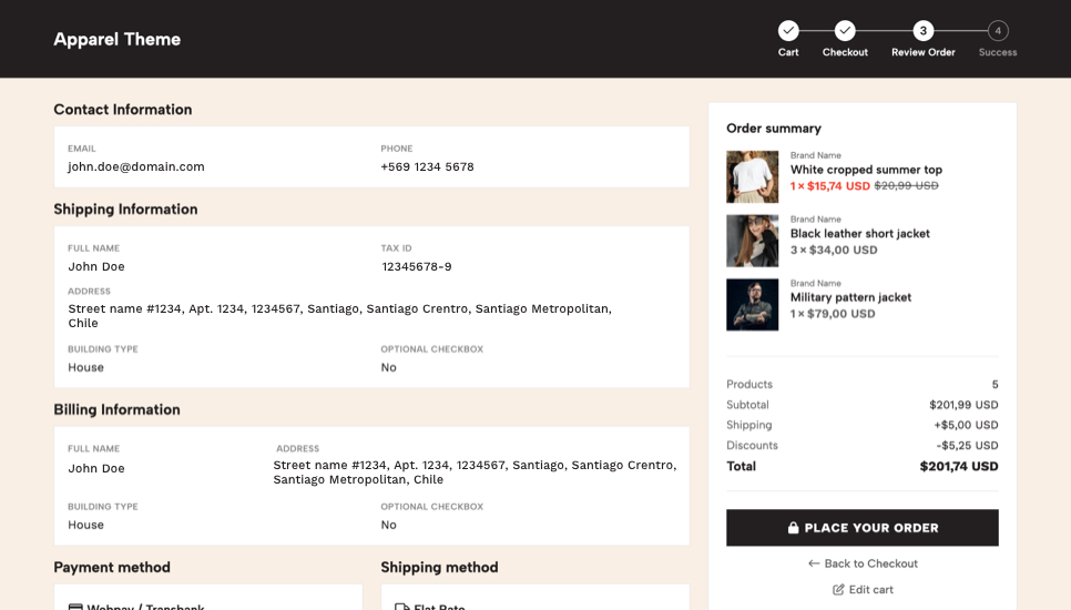
3.- Review Order
This is the third page of the shopping process and the Content section will present all the information that they added at the Checkout page, in almost the same order:
- Contact Information
- Shipping and Billing Information
- the selected Payment Method
- the selected Shipping Method
- Additional Information if it was added.
- Additional fields you may have added to your
Checkout formwill appear in this last section as well.
At the Summary section they will find the same information than in the Checkout page. The only difference will be the text inside the button that allows customers to Place the order. Below this button there will be links so customers can go back to the previous shopping process pages or to the Homepage of the store.
4.- Success page
The final page of the Shopping Process is the Success page, where customers arrive when they have successfully completed an order, whether it is from an external Payment Gateway like PayPal or directly through a manual payment option like a Bank Transfer.
In this page they will find all the details from their purchase, like the order number, the totals (e.g. subtotal, discounts, shipping costs, total) as well as the full list of products included in the order.
Templates
One of the most relevant features of a Jumpseller store is the ability to create and use as many templates as necessary for three types of content: Products, Categories and Pages. But you may wonder, what are these "templates"?
Templates are different -let’s call it files- where you can create different layouts, designs or place different information for different types of content. Let’s look at a pretty basic example:
You sell two types of products in your store: Physical and Digital. Let’s say that for the first one you will have a standard design layout, with the image gallery on the left, the product information on the right, and so on. But for the second one (Digital), you may want to display content reversed, so the image gallery is on the right and therefore, the product information on the left.
In order to achieve this you could do the following:
- Use the
Defaultproduct template for all your physical products. - Create and use a
Digitalproduct template, where the code has been modified in order to adapt and position the content that was mentioned before in different places.
Then, for each Digital product you will be able to apply the respective template and that way you can have 2 types of products with different design layouts. Pretty cool, right?
We decided to speak and let you know about this because Apparel comes with 4 Category templates apart from the Default one, so you can customize your category pages and present products in different ways.
Also, all Jumpseller stores come with 2 Page templates already created, apart from the default one: Blog and Post. The first is applied for the page that you’re gonna use as the Blog of your store. While the second one is the one that applies for each Article.
Default product template, so what has been explained before about Physical versus Digital products it’s merely an example.Pagination
The Pagination section is the one you can find in Category pages, the Search Results page, the Blog page and the Blog Article page. Next we cover each one in detail:
Category, Search Results and Blog
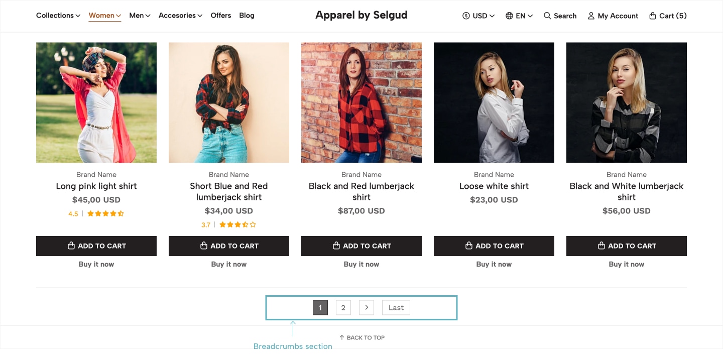
For the first three, this section will display if products in the page are more than the amount defined. Let’s look at an example:
Let’s say that in a Category you have a total of 120 products and you have defined at the respective settings (which you will find further below this Documentation) that the maximum amount to be displayed per page is 40. That will result in the category having 3 pages that can be “paginated”, where customers can switch and go back and forth between them.
The same applies for the Search Results page: If a customer searches for the “a” word and the search matches with 120 results (products), the Pagination will display 3 pages, with 40 products each.
For the Blog page the logic is pretty similar, as you can define how many articles will be displayed per page and that will define how many pages can be “paginated”.
Blog Article

In the case of the Blog Article page, the Pagination section is much simpler: It allows customers to go to the Previous and Next article -if they exist- based on the article they are currently seeing.
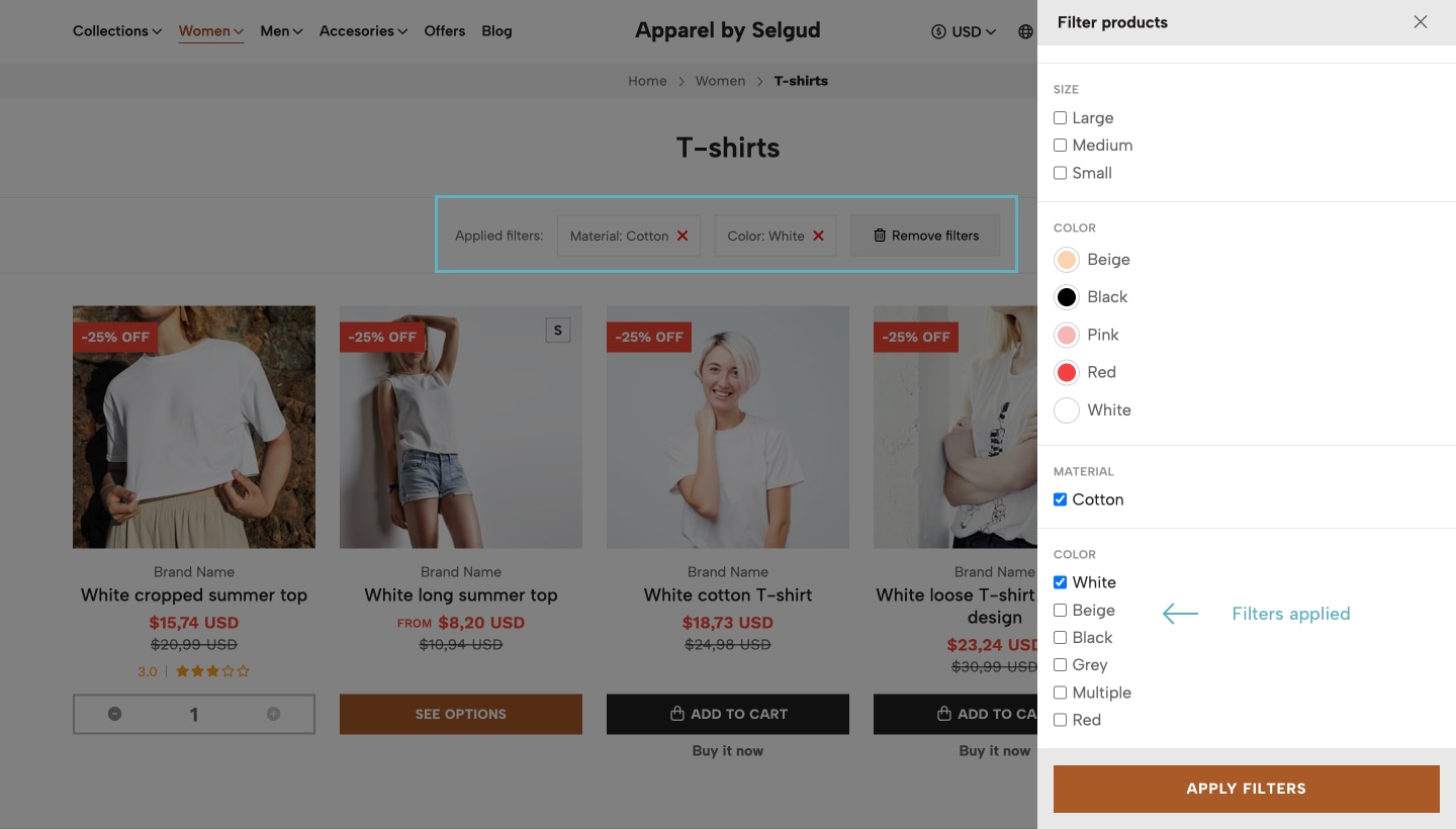
Filters
In Jumpseller you can create filters for the products of your store in two different ways:
- through Product Options: https://jumpseller.com/support/product-options/
- with Custom Fields: https://jumpseller.com/support/product-custom-fields/
Next we explain in detail each of them:
Product Options (or Variants)
In Jumpseller you can create what is called Product Options within a specific product and you might ask, why should I?
Well, let’s say you sell clothes and you have a Black T-shirt with different sizes: Small, Medium and Large. Normally you would create each of those sizes as individual products and would get something like:
- Black T-shirt Size Small
- Black T-shirt Size Medium
- Black T-shirt Size Large
Working with Product Options you can create just one product that has all those sizes as options, or strictly, variants. So for example, you could create just one product like Black T-shirt with options and create the option called Size. Then, on that option you would create the different variants mentioned above: Small, Medium and Large. Once you do that, customers can go to the product page and select the size (variant) they want to buy.
If you do the same for other products in your store then customers would be able to filter products on category pages and the search results page by Size.
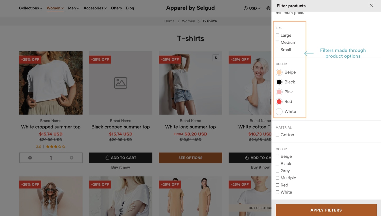
Custom Fields
Another way for creating filters is by adding a Custom Field on your products with the type Selection. For each one of these types of custom fields you can add several values that will be the filter options.
So, for example you could create a Custom Field called Brand and add to this field all the brand names of the products you have in your store. This way on a category page customers would be able to filter products by Brand.
Custom Fields of type Selection only accepts one value at the time. So for example, if you have two brands (e.g. Nike and Adidas) a product could only be associated with one of those values.Custom Fields differ from Product Options as the latest being variants of a product, meaning that to each variant you can assign a different price, SKU, weight and stock.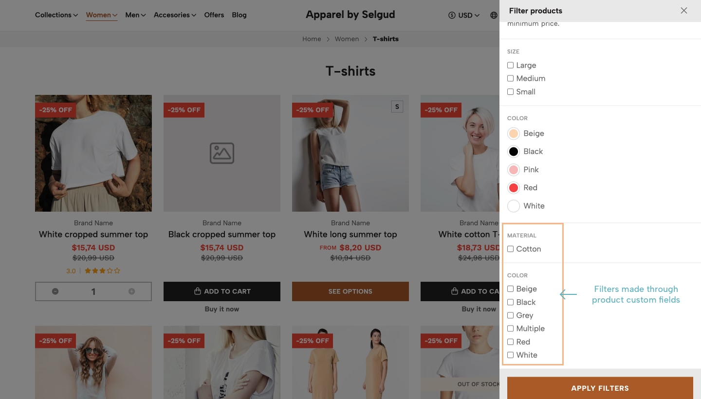
Resuming...
Product Options and Custom Fields (of type Selection) automatically create filters in the store, which you can view by going to Products > Filters at your store’s Administration Panel and re-order them or even disable the ones you don't want to appear. at the filters list.
So for example let’s say customers get to visit your T-shirts category and they will find the Filters button which by clicking will open the Sidebar Filters panel.
In there, they would find all the available filters that have been created and can select them simultaneously in order to make the most accurate selection based on what they’re looking for.
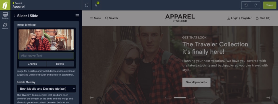
Overlay
On some sections, or more likely, on some Components within the theme you will find an option called Overlay, which you can enable, customize its color and even define on which devices it will be displayed, or if won’t be displayed at all.
This is an element that's used to generate contrast between the content of a section and a background image, mostly for cases where maybe the image doesn’t allow reading the content properly, like titles, descriptions or other similar elements. For a better understanding let’s look at some examples:
Blog
- Live examples:
- Blog page example
- Blog Article example
All Jumpseller stores come with the option to create, configure and use Pages of your store as a Blog and its respective Blog posts (articles). Here we’ll explain in detail how everything works and how you can make the most out of the available features and functionalities.
Article(s).Introduction
When you create your store and go to Pages > All pages you will find that there are two pages already created: Blog and Blog post. There will also be two page categories created: Blog and Post. You won’t be able to remove or delete the categories, nor the Blog page, as they are all necessary for everything to work properly. In the case of the Blog page, you can change everything from it, like the name, permalink, etc.
News page category and change the default Blog page name to be News.So, the relationship between the Blog page and each Article is defined based on the category you define that will be used to group all of the articles, which by default is Post. This will make that on the Blog page, all articles that have this category assigned will be displayed together. This also applies for the Blog component. You can modify how all this relationship works at the Visual Editor section of your store. For more detail check the Blog and Articles section of this documentation.
Page templates
Another point to notice is that all stores come with two Page templates already created, one for each page: Blog and Post.
So, if you go to the details of the Blog page and scroll down to the “Theme” section you will find that it uses the Blog template. The same goes for the Articles, which uses the Post template.
Therefore, in order for all your articles to have the same design, it’s extremely important that everytime you create a new Article (page) you apply the respective category and template to them, otherwise, they will look as a “normal” page because when you create a new page it uses the Default page template.
You can see what’s the design for both pages on Apparel’s Demo store.
Blog Articles Images dimensions
In order for you to get the most out of your Blog and Articles and they also look well, we leave here a detail of how images are used in the theme.
On the Article page the image will be used as the background of the main section, which includes: the title, the date (optional) and the share section. You have an option to control the width of this section and depending on what you choose, the image size should be one of the following:
- Browser Width: 1600x800px. You must consider here that the width should relate to what you have defined as the maximum width for the grid of your store, which is explained in the Store Grid section of this documentation.
- Grid Width: 1300x560 px.
On the Articles block, which are the ones that display for example at the Blog page, this works a bit different. As you will have the ability to define how they will be displayed, they will do proportionally based on the device where they are be seeing:
- Desktop and Tablet devices: 636x397px.
- Mobile devices: 575x358 px.
This will only apply if the selected option is Resize or Crop. You can read what each of these options do in the respective section.
To resume, the image you upload to the Article must be at the size that’s gonna be displayed in the Article page. For the blocks, the store will adapt it through code based on the selected option.
Customers
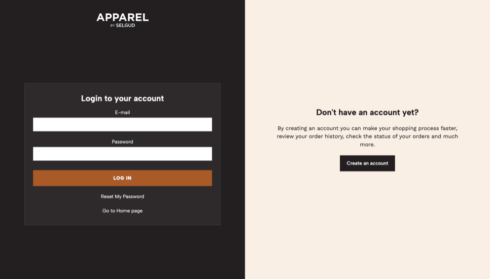
- Live examples:
- Customer Login
- Customer Registration
Jumpseller’s stores have basically 5 pages from where customers can perform certain actions, which displays different content based on its use. We will detail next these pages and what is the content they display, so you can better understand what are the things that you can customize and how it affects those pages. You can find the options to customize customer pages at the respective section of this documentation.
Customer Login
This page is the one that allow customers to access (log in) to their accounts and consists of basically two sections:
Login Form section
This is the form where customers can enter their email and password in order to login. They also have the link that allows them to reset their password in case they have forgotten or need to change it.
Create account section
This section allows customers that don't have an account yet, to go to the respective page in order to do so.
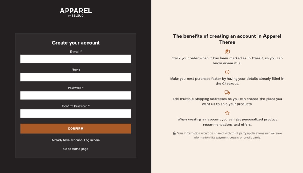
Customer Registration
This is the page where customers can create an account in your store and it displays the form that has the following mandatory fields: Email, Phone, Password and Confirm password.
The Apparel theme includes a section that can be displayed along with this form to detail and show the benefits of creating an account. You can read more about it at the respective section in this documentation.
This page is also used so customers can edit the basic details that have already been added.
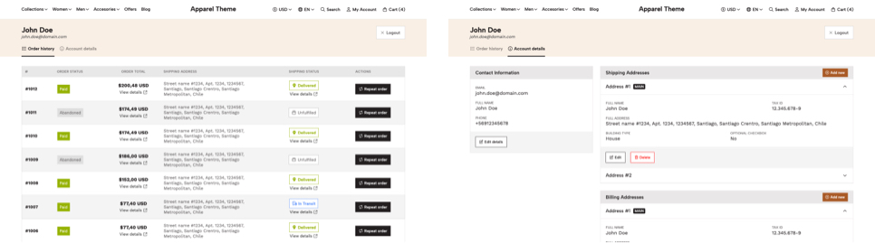
Customer Account
This page is available for customers who already have an account in your store and is divided into two sections (or "tabs"):
Order history
This section presents a list of all the orders that a customer has made in your store, with all the details for each order. It also includes the link for customers to repeat an order. This link can be disabled if necessary.
Customer Information
This section presents all the information that a customer has added, which is divided into 3 subsections, which are related to the details a customer has to fill at the Checkout page of the store: Contact Information, Shipping Information and Billing Information.
Customers will have the ability to add multiple Shipping and Billing addresses if they want to, so they can choose where orders need to be shipped or which Billing details will be used for an order.
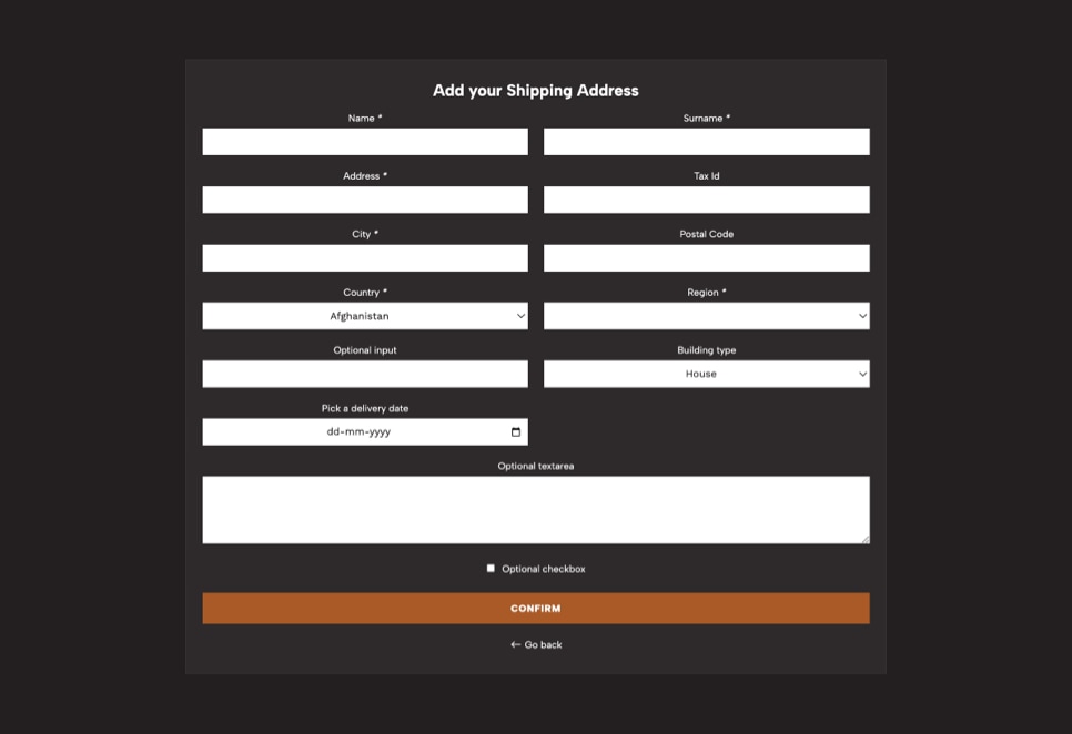
Edit/Add Address
This page is the one that’s available for customers who already have an account and allows them to Add a new Address or edit one that already exists. It’s used for both Shipping and Billing details.
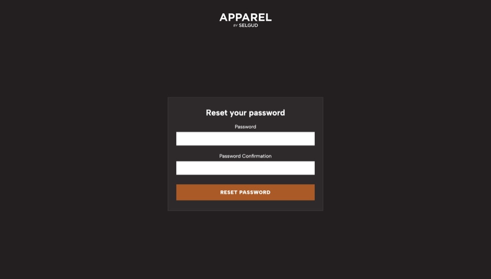
Reset Password
This page is the most basic one and it’s only used for customers that have requested to recover or reset their password. The reset or recover password process for all Jumpseller stores is the same and can be explained in the following steps:
- When customers are at the Login page and click on the
Reset passwordlink they will be asked to provide the email address related to their account. - They will get an email at the address they defined with a link that works for just 24 hours. When they click on the link, it will redirect them to the Reset Password page.
- Once they get to the page they will need to set the new password and confirm it.